

The Design Studio Behind the Iron Curtain
On February 9, 2001, after the hubbub of Macworld had died down, the industrial design studio was moved from the building on Valley Green Drive (across the road from Apple’s main campus) to a large space inside Apple’s HQ. The new design studio was put on the ground floor of Infinite Loop 2, known internally at Apple as IL2.
It was a big move logistically and symbolically. Bob Brunner had set up the original studio across the street to give it some independence from the rest of the company. Now Jony was being moved back right into the heart of Apple, allowing Jobs to work more closely with Jony and his team. It cemented the elevated status of design within the company. In Jony’s words: ID was now truly “close to the heartbeat of the company.”
It was a big move logistically, too. The studio is home to a lot of big machinery and prototyping equipment. In addition, everything in the new studio was custom made. “Every single thing in that space was custom made,” said Satzger. “Every piece of furniture, all the tables, the chairs, every piece of glass.”
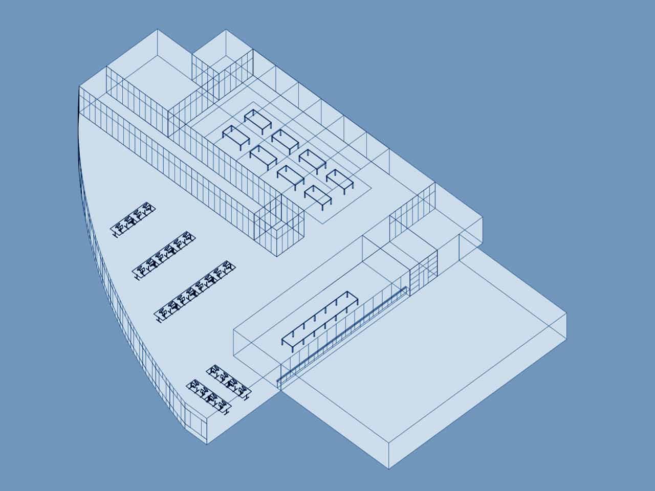
The studio is a large space, occupying most of the ground floor of IL2. It’s recognizable from the outside only by the wall of large frosted windows across the bottom of the building. The windows are frosted to prevent anyone from getting a peek inside. Security is extremely tight.
The studio is divided into several different spaces. To the left of the entrance is a well-equipped kitchen with a large table. This is the heart of the studio where Jony’s team conducts their bi-weekly brainstorming sessions. To the right of the studio’s front entrance is a small conference room that is rarely used.
Opposite the front entrance is Jony’s office. It’s a glass cube, and the only private office in the studio. It measures about 12 by 12ft. The front wall and door are made of glass with stainless steel fittings, just like the ones in Apple’s stores. Except for a small shelf system, his office is bare with plain white walls. There are no pictures of his family or design awards, only a desk, chair and lamp. The desk is custom made by Marc Newsom, one of Jony’s best friends. His leather chair is a Supporto chair from the UK office furniture manufacturer Hille International. Designed in 1979 by the award-winning designer Fred Scott, the leather and aluminum chair is recognized as a design masterpiece. Jony has named it one of his favorite designs, and selected it for the new Industrial Design Centre in Cupertino, California. “The Supporto is a wonderful chair,” Jony told ICON magazine. The studio is filled with them: the designers all sit at Supporto desks and leather chairs.
His desk is usually bare except for his 17-inch MacBook and several colored pencils for drawing, which are typically arranged neatly on his desk. He doesn’t use an external monitor or any other peripheral equipment.
Directly outside Jony’s office are four large wooden project tables, which are used to present prototype products to executives. This was where Steve Jobs’ gravitated when he visited the studio, which had become almost daily. In fact, this is where Jobs got the idea for the big open tables in the Apple stores. Each table is dedicated to a different project — one for MacBooks, another for the iPad, the iPhone and so on. They are used to display models and prototypes of whatever Jony wanted to show Jobs and other executives. The models are covered at all times with a black cloth.
Next to Jony’s office and the presentation tables is a large computer-assisted design (CAD) room. It’s another glass cube, also fronted by a glass wall. The CAD room is home to about 15 CAD operators or “surface guys.” If the designers want to see what a CAD model looks like as a real object, they’ll send the file to the CNC model shop next door. Sometimes they output “scrap models,” which might be a detail, like the corner of a product or a button.
At the far end of the space is a machine room, or “the shop.” The shop is also fronted by a glass wall. It is divided internally into three rooms separated by more glass walls. To the front are three big computer numerical control (CNC) machines. These are big hulking milling machines, capable of crafting anything from metal to RenShape. They have covers that keep any scrap material contained; and so are “clean.” Behind them are the “dirty” machines — various cutting and drilling machines that can create a mess. They are housed in a room sealed behind glass — the “dirty shop.” Next to the dirty shop to the right is a finishing room where the models and prototypes are sanded and painted. It contains some fine sanding machines and a big paint spraying booth about the size of a car.
The shop is used by the design team to make models of upcoming products. The CNC machines are used to make initial models or to quickly validate ideas. “They’d get a CAD file for surfacing; they would create a tool path based on the surfaces, do all the setups, and run a part,” said Satzger. Oftentimes, Jony’s team makes hundreds of models; just like Jony did in college. As the product development process progresses, the design team will outsource model making to an outside specialist firm.
Jony’s office, the presentation tables, the CAD room and shop are all to the right of the front entrance. To the left there’s an opening by Jony’s office that leads to the space where the designers work. It’s a large open space lined by the long wall of outside frosted windows. The designers work on five large tables, subdivided by low dividers. The space is messy and chaotic. There are boxes, parts, samples, bikes and toys everywhere. The atmosphere is light and fun. “Someone might be skateboarding in there, doing jumps, or Bart Andre and Chris Stringer kicking a soccer ball,” said Satzger.
Music is an important part of the design studio’s fun atmosphere. There are about twenty white speakers in the room, with a pair of thirty-six-inch-high concert subwoofers. “When you walked into this concrete and steel, highly reflective room, the sound was immediately deep and loud,” Satzger said. “All kinds of music from around the world is played. It’s really lively.. We had so much music on that thing, you could pick anything.
Jony is a big fan of techno. The music drove Jony’s boss, Jon Rubinstein, to distraction. “They played loud techno-pop in the design studio, which I found really annoying,” he said. “I like quiet so that I can focus and think properly. But the ID guys liked it.”
“The energy of that room, the noise of the room made me work a lot better,” said Satzger. “I hated sitting back in my little space…. for me, the louder the noise the better.”
Jobs liked the music too. In fact, he would turn up the music when he visited. “When Steve came in, he wanted the conversation to be between him and the person he was talking to,” said Satzger. “In all these open spaces, if it’s quiet, it’s really easy to hear what people are talking about. When he came in, we would turn the music up so that his voice would carry directly to one person only. You really couldn’t hear what he was saying.”
The studio visibly relaxed Jobs. “Steve in the ID space was a different person. he was a lot more relaxed and interactive,” Satzger said. “Steve had moods all the time. There were always things that were changing in how he approached people. But when he came in the ID space, he was always really comfortable.
Steve spent a lot of time in the studio, but when he was away, Jony used it as an opportunity to get some work done. “When he went away, we would do 150–200% more work,” Satzger explained. “It was a good chance to blast stuff out and put new work, new ideas in front of him when he came back.”
The Iron Curtain:
When the design studio moved onto the main campus, Jobs significantly beefed up security to prevent leaks. The studio is Apple’s ideas factory: the heart of the operation. Nothing must leak out. When the studio was on Valley Green, security wasn’t as tight. Visitors would get buzzed in by whomever was around. Jobs was determined that wouldn’t be the case in the new studio.
The vast majority of Apple’s employees are barred from the company’s design lab. Even some members of the executive team are forbidden from entering the studio. Scott Forstall, for example, who rose to be head of iOS software, wasn’t allowed to visit and his badge wouldn’t open the door.
Very few outsiders have been inside the studio. Jobs would occasionally bring his wife in. Walter Isaacson was given a tour, but described only the presentation tables. The only known photograph of the studio was published in Time magazine. The photo shows Jobs, Jony and three other executives sitting and standing around one of the studio’s wooden project tables, with the shop in the background.
Jony occasionally gives interviews on Apple’s campus in an engineering workshop full of CNC milling machines. It’s been identified as the design studio, but it’s not. It’s an engineering workshop nearby.
When working on new products, the software engineers have no idea what the hardware looks like, and the engineers have no idea how the software works. When Jony’s team was making prototypes for the iPhone, they worked with a picture of the Home screen with dummy icons. But the most secretive department of all is Jony’s group. “It’s locked down,” said Satzger. “People know not to talk about their work and what was going on inside Apple to the wrong people.” The ‘wrong people’ is basically anyone but your direct colleagues, and sometimes not even them. Even Jony is forbidden from telling his wife what he’s working on.
A former Apple engineer who worked closely with Jony’s group in the Product Design team said the secrecy was exhausting. “Out of everything I’ve ever done in my life, I’ve never seen a more secret environment than working there,” he said. “We were constantly under threat of losing our jobs for revealing any shred of anything. And even within Apple, your neighbors often didn’t know what you were working on. … The secrecy was like a gun to your head. Make one false move and we’ll pull this trigger.”
Apple’s policy means that the designers have gotten almost no press, and very little public recognition. They’ve won every award under the sun and are known in design circles. But to the public, they are basically anonymous. There’s little resentment about the lack of credit. The team is used to it. Jony is pretty gracious. He gets all the awards and recognition, but he always talks about the team. As one wag noted, the only time Jony says “I” is when he’s talking about about the iPhone or iPad. “We took it as, we’re all getting credit,” said Satzger. “[Apple] always says, ‘the Apple design team,’ but Steve never wanted us to be in front of the camera. They blocked headhunters and search people. Because we were blocked from facing media and hidden from headhunters and so on, we called ourselves the ‘ID Team That’s Behind the Iron Curtain.’”
Jony and his group are the principal inventors at Apple. They conceive and create new products, refine existing ones, and do some fundamental R&D, though they are not the only R&D group in the company (There’s no separate R&D group). They investigate new materials and production processes. They constantly refine and improve Apple’s products and manufacturing processes. Stringer defines the role of an industrial designer at Apple as one “to imagine objects that don’t exist and to guide the process that brings them to life. And so that includes defining the experience that a customer has when they touch and feel our products. It’s managing the overall form and the materials, the textures, the colors. And it’s also working with engineering groups to, as I say, bring it to life, to bring it to the market and to building the craftsmanship that it absolutely needs to have to have that Apple quality.”
Jony’s iDG group is small, about 16 designers from around the world. They are extremely tight-knit, especially because many of them have worked there for decades.
By comparison, Samsung has 1,000 designers working in 34 research centers around the world. Of course, Samsung makes many more products than Apple, and even some of some of components of the iPhone and iPad.
It sounds pat, but Jony’s group works as a team and each member contributes to each product. Unlike when he joined the company, Jony no longer designs any of Apple’s products alone. Each product is designated a design lead, who does most of the actual work, plus one or two deputies, though weekly meetings ensure the design process is a collaboration.
Two or three times a week Jony’s entire team gathers around the kitchen table for brainstorming sessions. All of the designers must be present. No exceptions.
The brainstorms begin with coffee. A couple of the designers play barista, making coffee for the group from a high-end espresso maker in the kitchen. Daniele De Iuliis, the Italian from the UK, is the coffee guru. “Danny D was the person who educated us all on coffee and grind and the color of the crema, how to properly do the milk, how temperature is important and all that stuff,” said Satzger, who was one of his keenest disciples.
The brainstorms typically last for three hours — from 9am to noon, or 10 to 1 and are used to hash out whatever design problem Jony’s group is working on.
Jony runs the brainstorms, but he doesn’t dominate them. They are freewheeling, creative roundtables where everyone is expected to contribute. Jony rarely misses the brainstorm sessions unless he’s travelling. “Jony’s always been involved in every design session,” said one designer.
The brainstorms are very focused. Sometimes it’s a model presentation, sometimes the detail of a button or speaker grille. There is never discussion of design philosophy. Blogs and magazine articles often note the influence of Braun’s Dieter Rams on Jony’s products, but he never discusses design philosophy with the group. None of the designers and engineers interviewed for this book said Jony ever espoused a particular design philosophy. Of course, all the designers are intimately familiar with Rams’ work and his 10 principles of good design; it’s drummed into every design student. But each and every design is approached on its merits. If there’s such a thing as a philosophy that drives Jony, it’s the desire to constantly simplify; to do away with as much as possible.
“[We] discuss our objectives, and so we can just be talking about what we would want a product to be,” said Stringer. “That ordinarily becomes sketching, so we’ll sit there with our sketch books and sketch and trade ideas and go back and forth. That’s where the very hard, brutal, honest criticism comes in and we thrash through ideas until we really feel like we’re getting something that’s worth modeling.”
Sketching is fundamental to their workflow. “I end up sketching everywhere,” said Stringer. “I’ll sketch on looseleaf paper. I’ll sketch on models. I’ll sketch on anything I can put my hands on, quite often on top of CAD outputs for want of better things to do.” Stringer likes CAD printouts because they already have the shape of the product. “You’re working with something that already has the perspective set up and the views in a way that you can sort of add in lavish detail upon them,” he said.
Jony is also an inveterate sketcher. He is a good sketcher, but speed is the key. “He always wanted to get a thought down on paper so that people could understand it really quickly,” said Satzger. “Jony’s drawings were really sketchy, with a shaky hand. His drawing style was really interesting.”
Jony is skilled, but the artists of the group are Richard Howarth, Matt Rohrback and Chris Stringer. Satzger describes Howarth’s sketchbooks as ‘works of art.’ “Richard Howarth would come in saying he had a crap idea and ‘you guys are going to hate it’ but then shared these amazing sketches.” Jony’s sketchbooks also are “really cool.”
When the group was designing the iMac, the table was covered with loose sheets of copy paper for sketching on, but Jony’s group no uses hardbound sketchbooks. Most of the group use hardbound canvas sketchbooks from Cachet by Daler-Rowney, a small British company. The studio’s office supply stockroom is stacked with them. They are made from high quality canvas and hardbound, so they don’t fall to pieces. Jony uses a blue sketchbook that’s about three times as thick as the Cachet sketchbooks and has a ribbon to mark the page. Howarth uses the same sketchbook.
Jony’s group uses hardbound sketchbooks because it’s easy to go back and look at their ideas; They document everything — Ideos’ rule of keeping a record of everything generated during a brainstorm. The sketchbooks became a contentious issue at the Apple-Samsung trial..
A lot of sketching happens in these sessions. At the end of the brainstorm, Jony will sometimes instruct everyone around the table to copy their sketchbooks and give the pages to the lead designer on the project under discussion. Afterwards, Jony will sit with the lead designer and carefully go through all the pages. Most major projects have a lead and two deputies, who will also pore through the pages trying to find ways to integrate new ideas. “Some days I’d be engaged and have ten pages of stuff,” said Satzger. “Sometimes you could feel when a designer wasn’t engaged in the material, when they weren’t filling up pages of things.”
The most promising ideas are taken to the CAD group next door who will turn a sketch into a 3D model. The model is then sent to the machine shop, where it creates a “tool path” for one of the CNC milling machines to cut the shape into RenShape or ABS to validate the basic size and shape. A “tool path” is at it sounds – a path determined by the computer that the cutting tool follows to create the desired shape.
Although they make up about half the staff in the studio, there’s a clear division between the CAD operators and the designers. The CAD sculptors are not afforded the same special status; they are in service of Jony’s design team. “There are a few designers that are capable of creating CAD themselves, but it’s not a requirement,” said Stringer during the Apple-Samsung trial. “In fact, most of us don’t. It’s a skill you need to dedicate significant time to just to understand the craft of CAD. We prefer our designers to be thinking, so we have a dedicated team for this.”
The CAD group comprise a separate group, and they keep to themselves. They rarely attend meetings and are kept in the dark (metaphorically and literally: the CAD studio is has very low lighting).
Models
When the group is ready to present ideas to Jobs or another executive, they outsource to a model shop that specializes in making realistic mockups. They want the models to look as much as possible like a final, finished product, and that requires specialist equipment and skills. Jony’s group frequently uses Fancy Model Company, a highly-respected model-making company based in Fremont run by Ching Yu, a modelmaker from Hong Kong. Most of the iPhone and iPad prototypes were made by Fancy Model Co. Each model costs around $10,000 to $20,000. “Apple spent millions on models made by that company,” said a former designer.
By contrast, the CNC machines at Apple, although capable of making pretty refined models, are used mainly for parts that are needed quickly — a lot of plastic shapes and smaller aluminum bits. The Apple CNC machines are rarely used to produce final models.
When it comes to choosing the right design, the finished models play a crucial role. For example, when designing the Mac Mini, Jony had about a dozen models made up of diferent sizes. The Mac mini is Apple’s “headless” Mac: a small aluminum box that comes without a monitor or keyboard and mouse; customers supply their own. It’s a relatively inexpensive product and at many companies would be low on the totem pole.
Jony had about a dozen models made up, ranging from very large to very small. He had the models lined up on one of the presentation tables in the studio. “We were there with some of the VPs and Jony,” said the former Product Design engineer. “They pointed at the smallest one and they said, well, obviously that is too small, that kinda looks ridiculous. Then they pointed at the other side and said, well, that’s too large, no one wants a computer that big. How do you find what’s right in the middle? And they talked through that process.”
The decision about the size of the case seems faintly ridiculaous, but it would influence what kind of hard drive the Mini could contain. If the case was large enough, the computer could be given a 3.5-inch drive, which are commonly used in desktop machines and are relatively inexpensive. If Jony chose a small case, it would have to use a 2.5-inch laptop drive, which is much more expensive.
Jony and the VPs selected an enclosure that was just 2mm too small to use a less expensive 3.5-inch drive. “They pick it based on what it looks like, not on the hard drive, which will save money,” the engineer said. He said he didn’t even bring up the issue of the hard drive; it wouldn’t have made a difference. “Even if we provided that feedback, it’s rare they would change the original intent,” he said. “They went with purely aesthetic form of what it should look like and how big it should be.”
Size considerations even influence things like the camera on the iMac. The iMac has a front-facing camera above the screen that is used for videoconferencing.
Another Apple engineer, who also asked to remain anonymous, worked with Jony’s team on adding a camera to the iMac. “The biggest challenge was how small Steve Jobs and the ID group wanted the opening for the camera to be,” he said. “The size of the opening had to be as small as possible for aesthetic reasons, which should come as no surprise. I have little doubt that if the opening could have been made invisible, it would have been.”
The design process is not linear. On a fundamental level it starts with a brainstorm and sketching, leading to finished models that show the form and finish of a proposed product; but the process is extremely fluid. Products are often explored in several parallel directions; they are restarted or scrapped. “These processes, though they seem very linear, and in instances can be, typically aren’t because we’ll go back and forth,” said Stringer. “We’ll even sketch on models. We’ll combine a part model and a sketch from another sketch book from a different design session. It’s back and forth. It’s non-linear. It weaves and knits its way along the design process, ultimately to a point where we feel really satisfied that we have something special.”
Jony’s Role
In recent years Jony’s role has become more managerial than design driven. Jony doesn’t design any of the products alone, but he adjudicates every single design decision the group makes. Nothing is done without his input, whether it’s the color of a product or the detail of a button. “Everything is reviewed by Jony,” said one of the designers. Jony runs the group and recruits new members. He is the conduit of information between the design group and the rest of the company, especially at the executive level. He worked very closely with Steve Jobs when he was alive and now with Apple’s executives to select what products to work on and what directions they should take.
“Every design idea goes through Jony,” said Satzger. “An early methodological failure used to be that there were lots of good designers at Apple, who were all allowed to work on different things simultaneously. There was no control over these people. Later, Jony became involved in every design session, and the team took everything he said very seriously.”
“Jony is very effective as a leader. He is a soft-spoken English gentlemen who had Jobs’s ear. He never managed people like he was the boss. He was pretty neutral. And he treated everyone’s opinion as important. He would sit down with people and begin with, ‘Steve’s not happy with where we are. We need to start building models and come up with new ideas. We need to do something different.’ Then for the next week every day the team would have all-morning design sessions.”
In many ways, Jony was the hand implementing Jobs’s vision. If Jobs didn’t like something, he’d say so, but that was the only direction he gave. He pushed Jony and his designers to come up with the right solution.
On many occasions, Jony managed up. “A lot of times, it was Jony who would drive Steve,” said Satzger. “He might say to Steve, ‘I think we should change this,’ if he felt that it was important to do something different.’”
“Jony’s team in the design studio comprised a great group of people,” said Rubinstein. “They were obviously having fun doing really cool designs. They were a small, really close-knit team that works really well together. Jony is a great leader at driving the team.
“Jony is a good leader. He is a brilliant designer, and his team respect him. Jony has very good product sense. And when he is immersed in the design process, his work is a collaborative effort. Although in the press Jony gets all the credit, in reality his whole team does a lot of work. They are a talented team that does brilliant work together. They all contribute tremendously with great ideas.
“It is very iterative process. It is lots and lots of different designs, lots of different directions. We as a team would get together: Me and Steve and Phil and Jony would get together and go through the designs and Jony’s team would evolve a direction. And we’d do that again and again until we finalized what it was going to look like.
“As a personality, Jony Ive is low-key. He hides the ego behind that. He can be a very intense guy. Sometimes he can be very intense. He is soft spoken, but also very firm in his beliefs. He jokes occasionally, but mainly has a serious comportment. He was always very focused on his career, and aware of the politics to move up within the company. The public persona of Jony Ive stating that all that matters to him at Apple is design — is nonsense. He was very focused on his career.”
Jony’s group is extremely tight. Insular isn’t the word. They work together, eat together and socialize together. Every day, four to eight of the designers go to lunch together, usually at the cafeteria. They generally don’t mingle with other Apple staff; they eat at their own table.
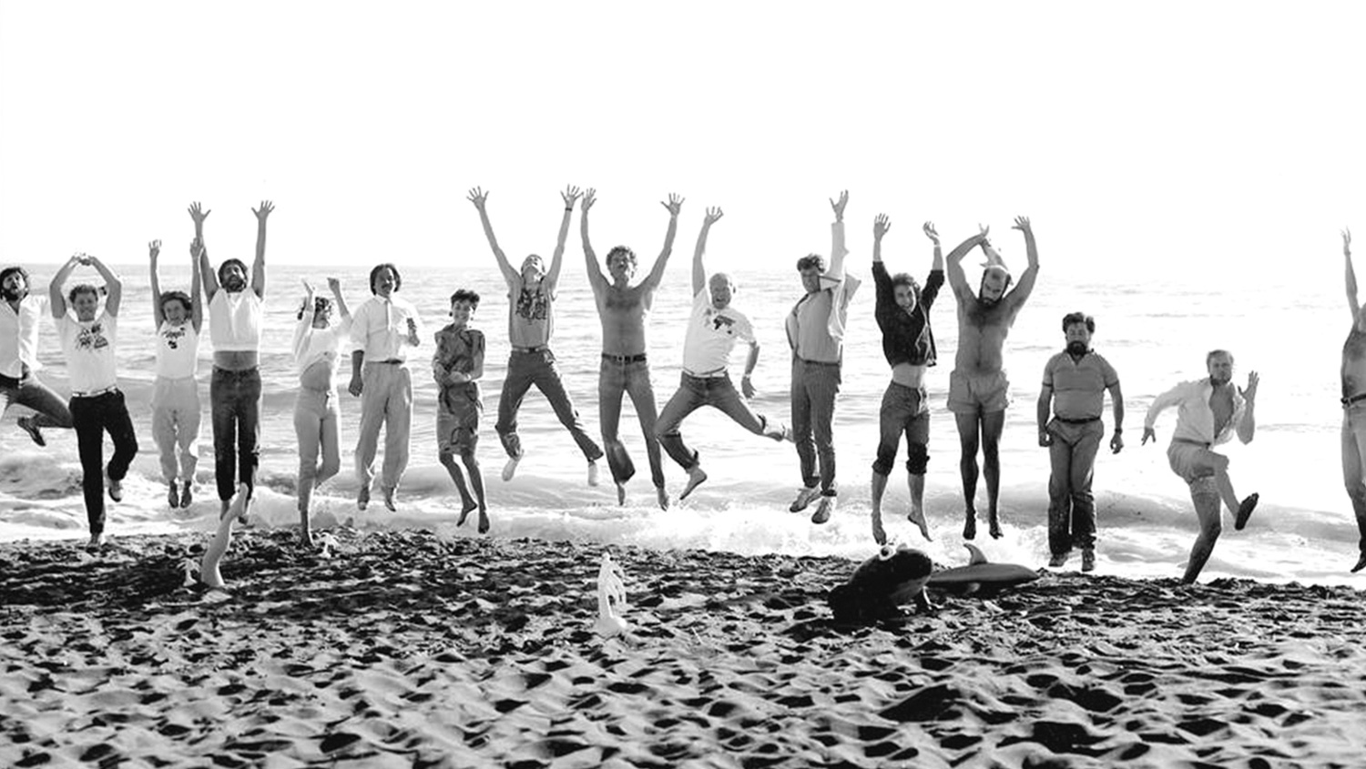
The designers socialize together after work, especially those living in San Francisco. For many of the designers, social life and work are one. That includes Jony. “If I did something, unless my wife arranged it, it was with them all,” said Satzger. “The SF group was a lot more tight. Bart, Chris, and me hung out. Danny and Jony and Richard and Matt got together all the time and saw Eugene. Duncan was more independent. They liked drinking a lot of champagne and spent a lot of time at Le Colonial.” Le Colonial is a stylish French Vietnamese restaurant in San Francisco.
“At MacWorld we’d get a limo and go. The limo was full of Bollinger champagne. We’d drink and go to dinner somewhere, then end up in the Redwood Room [a cocktail bar in San Francisco’s Clift Hotel] and drink some more. We’d reserve it whenever Jony’s friend Marc Newson was in town. Then we’d end up at the Clift Hotel and Bart or Jony would rent a room and the design team, and maybe a couple other people, were always there.”
The former Product Design engineer remembers being at a black-tie event at the Clift Hotel. “Around midnight in rolls the ID crew for the after party that is going on in the hotel lobby,” the engineer said. “Stringer, Ive, Whang, and a bunch more were there. I’m asking Ive, ‘what are you doing here?’ They just roll out at night and do select exclusive bar hopping. They had a reserved area. They’re always very trendy, into trendy music.”
Many of Jony’s team have kids. Even though the design studio is off limits to outsiders, the designers frequently bring their kids in.
Satzger brought his kids into the studio all the time. His daughter is interested in pursuing a design career. She wrote a college essay about growing up in the Apple ID studio, about process and how things were built and why. “She was part of the group, she could found be there for 8-10 hours. Everyone brought their kids in.”
Except Jony. Jony always kept his wife twin sons Charlie and Harry pretty secret. Some of the designers who live in San Francisco know his family, but to the others they are a mystery. It’s an odd exception for a man who’s father had such a strong influence on his son’s interest in design.
Jobs Interest In Design
Jobs’ plan to make industrial design the centerpiece of Apple’s comeback should have been no surprise. Design had always been central to Jobs’ MO. Unlike Jony, Jobs didn’t have a formal design training, but he had an intuitive design sense that went all the way back to his childhood. He grew up in a house that was inspired by the tract homes of Joseph Eichler, a post-war developer who brought the Mid-Century Modern aesthetic to the architectural landscape of California. Although Jobs’s childhood home was what he would have probably referred to as a knock-off of an Eichler (what Eichler fans call a “Likeler”) it made an impression on him. Describing his childhood home, Jobs said, “I love it when you can bring really great design and simple capability to something that doesn’t cost much. It was the original vision for Apple.”
In fact, Jobs’s appreciation for good design may well have run in the family. “I thought my dad’s sense of design was pretty good,” Jobs said, “because he knew how to build anything. If we needed a cabinet, he would build it. When he built our fence, he gave me a hammer so I could work with him.”
One concept that stuck with young Steve while he was working with his father was that good design wasn’t just on the exterior of an object. It permeated. “He loved doing things right. He even cared about the look of the parts you couldn’t see,” Jobs recalled. He said that his father refused to use poor wood for the back of cabinets, or to build a fence that wasn’t constructed as well on the back side as it was the front. Jobs likened it to using a piece of plywood on the back of a beautiful chest of drawers. “For you to sleep well at night, the aesthetic, the quality, has to be carried all the way through.” Jony also shared this sense of quality. He’d never slap a piece of cheap plywood on the back of his products.
For Jobs, design was not how an object appeared, but how it worked. ”Most people make the mistake of thinking design is what it looks like,” Jobs famously said. ”People think it’s this veneer — that the designers are handed this box and told, ‘Make it look good!’ That’s not what we think design is. It’s not just what it looks like and feels like. Design is how it works.”
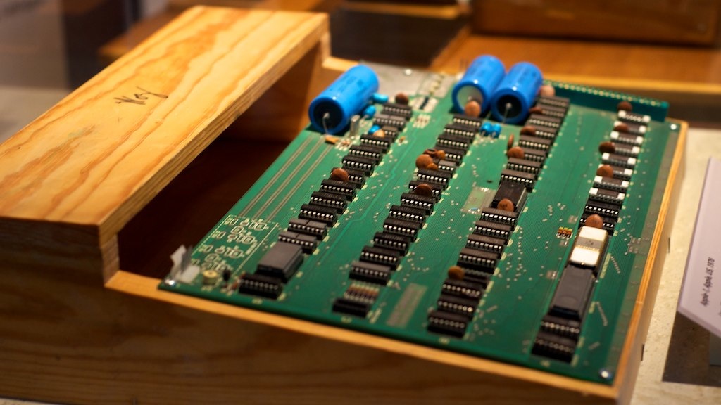
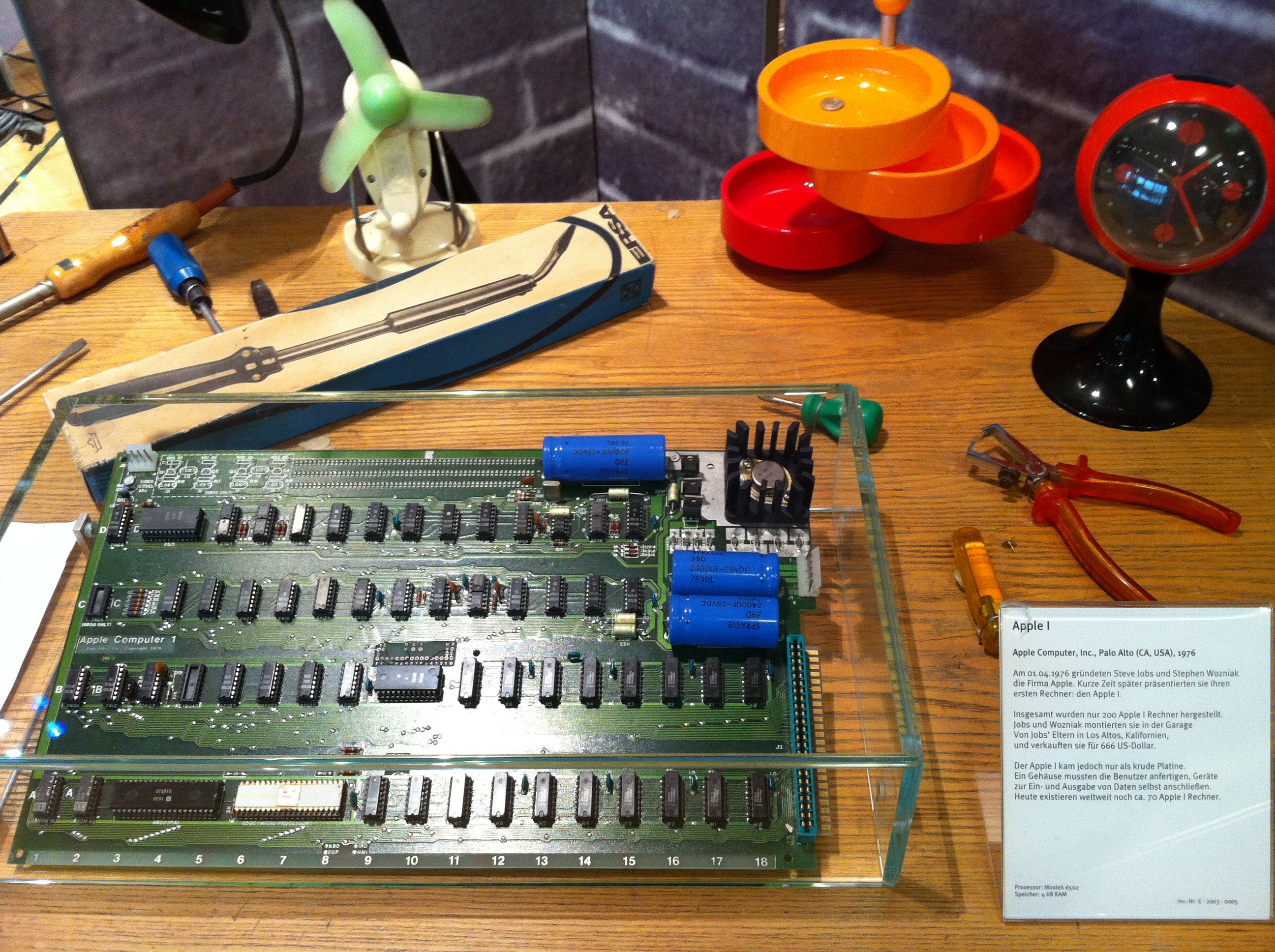
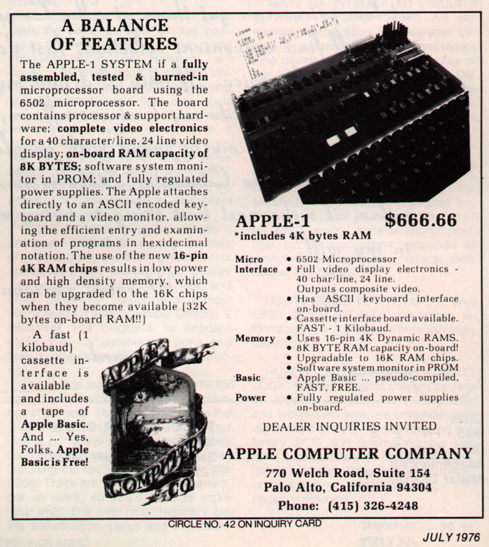
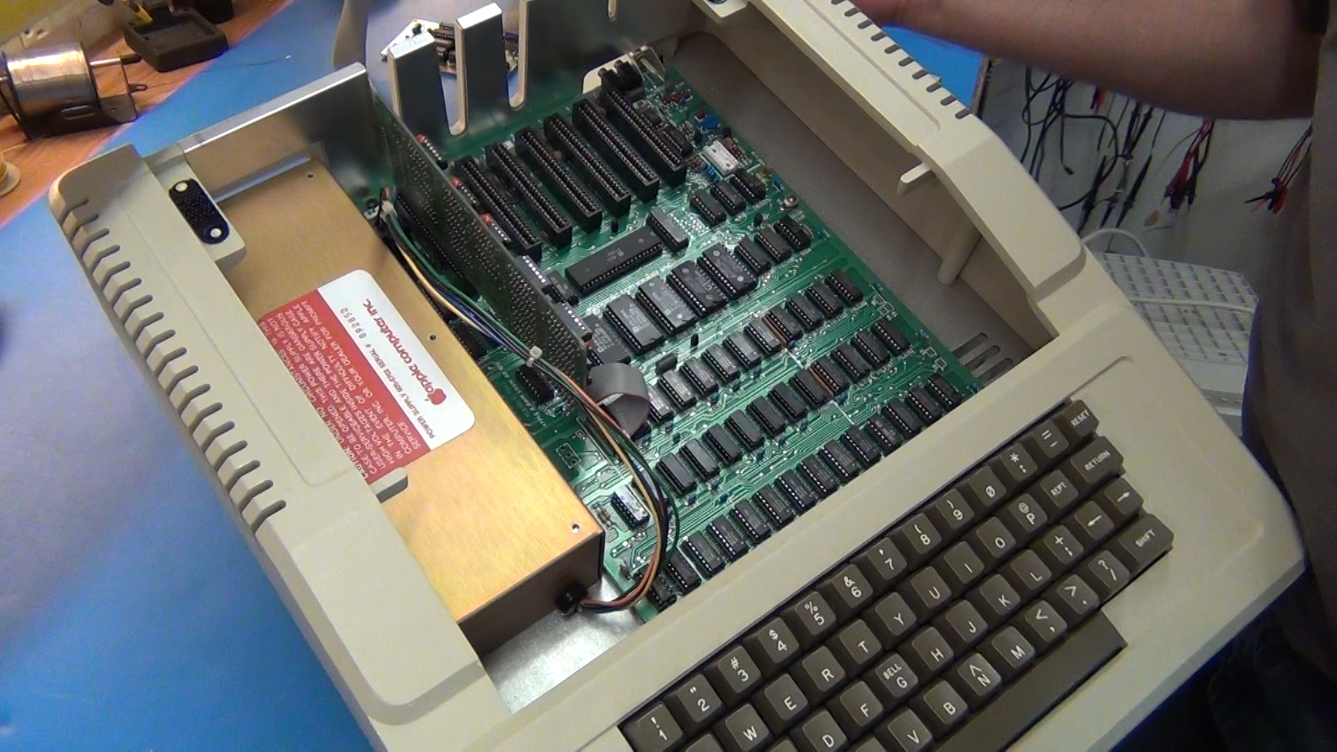
This sense of design would eventually make Jony’s design group the very heart of Apple. But it is a sophisticated definition of design that took Jobs some years to arrive at. At first, Jobs was more concerned about appearance. When Steve Jobs helped create one of the world’s first personal computers, the Apple I, back in 1976, the hobbyist aesthetic of the early PC scene offended him. It was too DIY. Designed by his friend Steve Wozniak and assembled by hand in a garage, the Apple 1 was just a motherboard, which customers would build by supplying their own power supply and monitor, then putting it in a “case”, which was usually an old orange crate.
This was not the way Jobs wanted it. He wanted to transform home computing from a DIY affair into a real industry. Jobs wanted Apple to sell finished computers to paying customers. He envisioned the PC as something that you took home and plugged in, like a TV or a toaster. That meant that Apple’s computers needed to look like real products with cases that signaled their function as consumer products, no assembly required. It had to have a nice plastic case with gently rounded corners and a warm, welcoming texture. A well-designed exterior would inspire first-time computer buyers to take the plunge, making it appear to be no taxing to use than any kitchen appliance. You just unboxed it and plugged it in.
Thus was born the Apple II, which first came off the drawing board in 1976, soon after Jobs and Woz sold the first batch of Apple Is. It was the computer that would change Apple’s fortunes, and while Wozniak concentrated on getting the cutting-edge hardware right, Jobs focused on what he thought really mattered: the way it looked. “It was clear to me that for every hardware hobbyist who wanted to assemble his own computer, there were a thousand people who couldn’t do that but wanted to mess around with programming… just like I did when I was 10. My dream for the Apple II was to sell the first real packaged computer… I got a bug up my rear that I wanted the computer in a plastic case.”
Other companies were putting PCs in cases made of sheet metal. They were cheap, and offered great electromagnetic shielding, but they looked utilitarian. No one had ever even thought to treat a home computer like an appliance and put the guts of it in a plastic case. That fact alone created a problem of precedent for Jobs: even he had no idea what a finished computer should look like.
To gather inspiration, Jobs scouted department stores. He finally found what he was looking for while strolling the kitchen section at Macy’s and coming across a counter full of Cuisinart food processors. It was perfect. Like a Cuisinart, a computer was made up of a lot of parts that were dangerous to the touch and intricately interconnected, but this complexity was hidden away beneath a nice molded plastic case with smooth edges, muted colors and a lightly textured surface. This was what Jobs wanted for the Apple II.
Initially, Jobs approached a couple of Silicon Valley’s top design firms, but he had a hard time getting them to take him seriously. He looked like a hippy and had no cash. He offered one firm stock in Apple. They declined (and deeply regretted it later). Eventually, however, Jobs was referred to Jerry Manock, a designer who had just left Hewlett-Packard and gone freelance. “When Steve asked me to design the case for the Apple II, it didn’t occur to me to say no,” he said. “But I did ask to be paid in advance.”
The case Manock built for Jobs was the first of its kind and a classic to this day. The primary goal was something that could be quickly and cheaply made. Jobs wanted to launch the Apple II at the world’s first conference for personal computers: the West Coast Computer Faire in April 1977, which was only a few weeks away. The size and shape of Manock’s case was determined by Wozniak’s motherboard. He gave it a sloping wedge at the front to fit the Apple II’s built in keyboard. It was also taller at the back to accommodate the Apple II’s expansion slots. Jobs — thinking, perhaps, of his father’s backyard fence — wanted the insides to look good if the user was to open the case, so he asked Manock to coat the cases inside with chrome. Manock ignored him, and Jobs never pursued the idea.
He was right not to push it. When Apple got the first molds of the new case back, he already had his hands full. They were in rough shape. They had to be filled and painted to look presentable, and the lids had to be sanded to fit their bases. Chrome inside would have just been another complication which Apple could ill-afford: the Apple II’s big debut at West Coast Computer Faire was coming up.
Manock had 20 cases made for the Computer Faire, but only three were working models with circuit boards inside. Jobs put the three working machines at the front of the booth to show to customers. He carefully stacked the seventeen empty cases at the back, making it look like they already had a production line going. His little subterfuge worked. Apple looked far more professional than other companies at the Faire. “Compared to the primitive stuff on view elsewhere at the Faire, our finished plastic blew everyone away,” recalled Manock. “Even though Apple was only a few months old, the plastic cases made it look we had already achieved high-volume production.”
As Jobs had surmised, it was the case that made all the difference. Before Bill Hewlett designed the first “pocket” calculator, most calculators were large, expensive, desktop models. HP expected to sell maybe 50,000 units. But Hewlett instinctively felt that scientists and engineers would love a small, pocketable calculator in a slim plastic case. He was right. HP sold fifty thousand of the iconic HP-35 calculators in the first few months.
The same was true with the packaging for the Apple II. A friendly plastic case had been all that was needed to transform it in the minds of consumers from a build-it-yourself project for geeky hobbyists into a plug-and-play appliance for the average customer. The Apple II wasn’t made for the kind of hobbyists who felt most at home soldering a circuit board: it was for people who wanted to run some easy-to-use software.
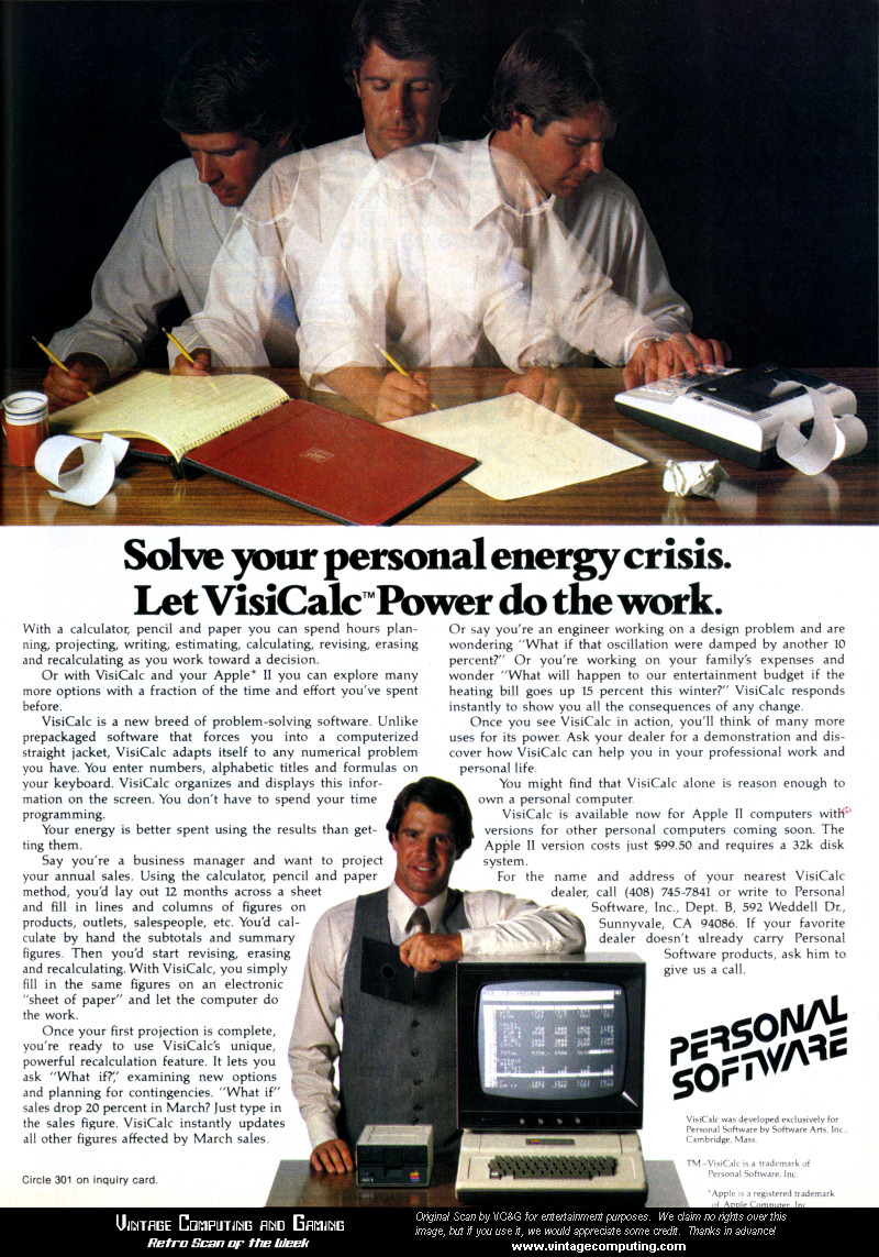
Soon, software for the Apple II started taking off. A couple of students from Harvard created the first killer app for the Apple II: Visicalc, the world’s first computer spreadsheet that allowed tedious business calculations to be made more easily. A killer app is a piece of software that drives hardware sales, like the Halo game on Microsoft’s Xbox: Customers by the hardware to run the software. More than anything else, Visicalc helped cement the Apple II as a must-have tool in most businesses.
Thanks largely to VisiCalc — the Apple II’s crucial “killer app” — the Apple II exploded tenfold in the first year, from $770,000 in 1977 to $7.9 million in 1978. By 1979, sales of the Apple II reached $49 million. It was the fastest-selling computer ever up until that time. Apple was only three years old and was already in the Fortune 100.
The Apple II’s case was just the beginning. Now that it was a success, Jobs wanted to get serious about industrial design, which he believed could be a key differentiator between Apple’s consumer-friendly, works-right-out-of the box philosophy and the bare bones, utilitarian packaging of early rivals like International Business Machines. “IBM has it all wrong,” he would say. “They sell personal computers as data-processing machines, not as tools for individuals.” Jony had the same instincts. At Tangerine, he hated the geeky aesthetic of 80’s electronics. They were designed only to appeal to geeks, not the much bigger market of ordinary people.
In 1981, with the PC revolution not yet five years old, Jobs thought Silicon Valley had just scratched the surface. Only 3% of US households had a personal computer (including toy systems like the Commodores and Ataris). Only 6% of of Americans had even encountered a PC at home or work. Jobs thought the home presented a huge opportunity. Trouble was, early computers weren’t easy to use. They required some knowledge of programming. Users had to type arcane commands into the so-called command-line interface.
It would take him five years, but the product Jobs envisioned that would represent the first truly uncompromised look at Jobs’ ideas about design would eventually arrive. It would be called the Macintosh.
After getting a peek at the first graphical user interface in 1979 at Xerox’s famous research center, Xerox Parc, Jobs realized that a graphical interface would do for computing what Ford’s Model T did for the automobile — revolutionize everything. Jobs started calling the Mac the “first crankless computer.”
Key to making the crankless computer appeal to the masses would be to make it unintimidating, even “friendly.” But what does that mean? What are the physical attributes of a “friendly” product? This is something Jobs would discover through a prototyping process that designers like Jony were taught in Design 101, but Jobs discovered himself, intuitively.
Working with Manock again, Jobs had just three initial design constraints. To keep it cheap and make it easy to manufacture, Jobs insisted on one configuration and one configuration only; just like his hero Henry Ford’s Model T, which was available in any color as long as it was black. It would be ‘crankless.” Jobs wanted the Mac to be immediately accessible to anyone who sat in front of it, whether they’d laid eyes on a computer before or not. A new owner should just be able to plug a Macintosh into the wall, just like a Cuisinart, and press a button, and it would work. That meant no setup. It would have none of the wires and plugs of other PCs. It would be the world’s first all-in-one PC: the screen, disk drives and circuitry all be housed in the same case, with a detachable keyboard and mouse that plugged in the back. This was a new idea. In addition, the Macintosh needed to be small and not take up too much space on a desk, so Jobs and his design team decided it should have an unusual vertical orientation. This put the disk drive below the monitor, instead of to the side like other machines at the time.
Manock and his fellow designer Terry Oyama created numerous front and side view drawings showing how the disk drive slot looked with the CRT screen. Jobs reviewed the initial designs, pointing out what he liked and what he didn’t. “We explained why we were presenting certain forms, and Steve would comment on whether he thought they achieved their stated goal,” Manock remembered. Manock said Jobs often asked for three alternative solutions to a problem — something that would occur again and again throughout his career, especially when working with designers.
Jobs had a reputation as a volatile taskmaster, but Manock said he was positive and helpful. There were no tantrums. In fact, Jobs was always positive, Manock said. He never said he disliked something. Instead, he would say he liked a feature, but he liked another approach better. The models would be reviewed by Steve in a “like-like better” fashion,” said Manock. “I don’t remember any harsh rhetoric,” he said.
Manock and Oyama made a model out of white Foam Core, a rapid prototyping material that is easily shaped. Foam core models bring drawings alive, making it easy to see if a certain shape works instead of trying to imagine it. Jobs gathered the Macintosh development team together to critique it. Andy Hertzfeld, a key member of the team who wrote a lot of the system software, thought it was cute and attractive, and had a distinct personality. But Jobs knew how to critique it very precisely.
“Steve cut loose with a torrent of merciless criticism. ‘It’s way too boxy, it’s got to be more curvaceous. The radius of the first chamfer needs to be bigger, and I don’t like the size of the bezel. But it’s a start.’” Hertzfeld wrote. “I didn’t even know what a chamfer was…”
The design process continued for several months. Manock and Oyama made several new models, and Jobs assembled the team for their feedback. Every time there was a new model, all the old ones were lined up next to it for comparison. “By the fourth model, I could barely distinguish it from the third one, but Steve was always critical and decisive, saying he loved or hated a detail that I could barely perceive,” Hertzfeld recalled. It took several prototypes to finally get it right. Oyama also did some studies of the case’s details using an oil-based clay — the same clay used by designers in the automobile industry.
The first case prototype was machined out of clear Plexi-Glas, which took about a month. “By holding a stick of incense next to the lower air vents, we could see the convective air flow out the top vents,” said Manock. “This is how we came to add vents on the top surfaces… the smaller vents at a 45 degree angle on the back didn’t allow fast enough air velocity. Then Plastic Tooling Aids, near Boulder, Colorado did aluminum ‘soft tooling’ to give us production quality ABS plastic parts. These tools (molds) could be changed relatively easily as compared to the hardened steel tools that were capable of making 1,000,000 parts. I think we changed the disk drive slot at the soft tooling stage. When we were relatively sure of the design, the go ahead was given to start making the steel “hard” tool, which would take at least 3-4 months.”
When the molds were done, Jobs had 35 key members of the team celebrate their accomplishment by breaking open some champagne and “signing” the inside of the case.
To make the case durable and scratch resistant, Manock used the same grade of tough ABS plastic that was used to make LEGO bricks and gave it a fine, scratch-resistant texture. Troubled by the way earlier Apple IIs had turned orange in sunlight over time, Manock decided to make the Macintosh beige… starting a trend in computers that would last twenty years, and that Jobs and Jony would have to team up to abolish with the colorful 1998 iMac.
Like Jony, Jobs paid close attention to every detail. Even the mouse was designed to reflect the shape of the computer: it has the same dimensions, and its single square button corresponds to the shape and placement of the screen. The power switch was put around the back to stop it being switched off accidentally (especially by curious kids) and Manock thoughtfully put a smooth area around it to make it easier to find by touch. “That’s the kind of detail that turns an ordinary product into an artifact,” Manock said. It was exactly the kind of detail Jony paid attention to, adding a fiddle button to a pen or making the Newton’s lid pop like a car trunk.
The Macintosh looked like a face, with a slot for the disk drive resembling a mouth and the keyboard recess at the bottom looking like a chin. Jobs loved it. This is what it took to make the Macintosh look “friendly” — an anthropomorphic smiley face. “Even though Steve didn’t draw any of the lines, his ideas and inspiration made the design what it is,” Oyama said later: “To be honest, we didn’t know what it meant for a computer to be ‘friendly’ until Steve told us.”
Making the Mac friendly would be one of the keys to its success, and to the success of later products. Friendliness became a defining characteristic of Jobs’ intuitive design sense, and Jony’s too. Subsequent hit products like the iMac had a distinct, anthropomorphic personality and were manifestly ‘friendly.” While products like the iPod and iPhone were less overtly friendly, they are certainly approachable.
While Jobs had obsessed about the design of the Macintosh’s case, he had made some bad decisions about its internals. When the Macintosh was released in January, 1984, it only had 128K of memory. It was a choice Jobs had made to save money, but it was a fraction of what the Macintosh needed, making simple tasks like copying files grueling affairs. “What I (and I think everybody else who bought the machine in the early days) fell in love with was not the machine itself, which was ridiculously slow and underpowered, but a romantic idea of the machine,” wrote the science fiction writer Douglas Adams, an early fan.
Luckily, one of Jobs’s hardware engineers, Burrell Smith, had anticipated the problem. Forbidden by Jobs to even consider putting more memory in the machine, Smith had secretly included the ability for the Macintosh’s memory to be expanded to 512K. Apple was able to correct their mistake by releasing a much-improved 512K Mac just a few months later. Jobs would make a similar mistake with the first iMac a dozen years later; a mistake that ultimately made him work much more closely with Jony.
Unfortunately, the Macintosh was the last product that Steve Jobs would see to market during his first tenure at Apple. About 18 months after launching the Mac, in September, 1985, Steve Jobs lost a boardroom power struggle with John Sculley for control of Apple. Jobs was quit/fired by Sculley, an ex-Pepsi-Cola marketing executive that Jobs had recruited himself to be the company’s new CEO.
Even so, Jobs influence had such a strong influence on Apple’s standard for design, that his ideas persisted almost as long as it took him to come back to the company in 1997.

Snow White
While Manock and Oyama were working on the Mac, Jobs had also been searching for a design language for the entire company. Part of the genius of the Mac is the consistency its software. All the software that runs on a Macintosh confirms to the same standard rules, which makes it easy for users to understand and use. Menus and dialog boxes all looked the same, even between different applications. The file menu is always in the same place. Folders look and behave the same, and dialog boxes were consistent and predictable.
But while the software had a consistent “design language,” Apple’s hardware was all over the place. The company’s different divisions — the Apple II division, the Mac division, Lisa, peripherals — were all using different designers with different ideas. Apple’s products looked like they came from four different companies, not one. It drove Jobs crazy. Later, when Jobs returned to the company, he and Jony would establish a very clear design language for the company that went through several iterations.
Another factor was money. Both Apple and Jobs were flush with cash. As Jobs’ personal stake in the company approached $250 million, he traded in his tatty shorts and flipflops for expensive suits and tailored shirts. He began exercising his passion for art, architecture and design in Apple’s headquarters, which had to be gutted and refurbished with no expense spared, even if the buildings were brand new. Likewise, he insisted Apple’s ads, brochures and marketing materials were of the highest quality and of the highest aesthetically standard.
As far as Jobs was concerned, Apple had invested in the best programmers, the best engineers, the best accountants, but it hadn’t hired the best designers. Jobs started talking about making Apple in the 80s what Italy’s Olivetti was in the 70s — the undisputed world champion of industrial design. Olivetti was world famous for TK; Jobs wanted Apple to take the crown.
There had been an explosion of design in the early 80s at the beginning of “the designer decade.” Design was especially hot in Europe, with groups like Italy’s Memphis Group of architects and designers earning accolades for their bold, colorful designs (memorably described as “a shotgun wedding between Bauhaus and Fisher-Price”). The Milan-based collective created a series of highly influential products in 1980s.
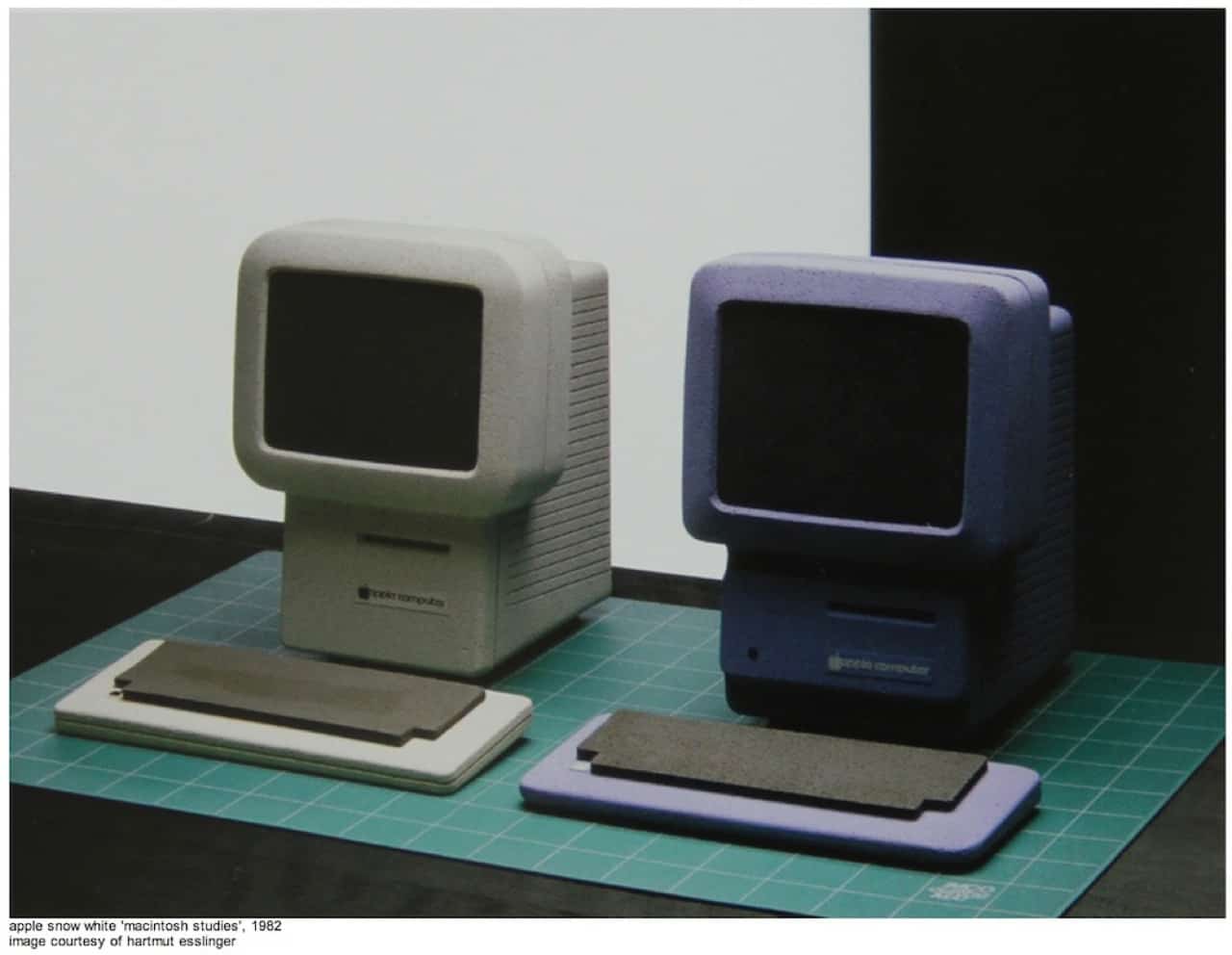
In March, 1982, two years before the Macintosh was unveiled, Jobs started looking around for a way to make Apple’s hardware as consistent as its software. Jobs decided Apple needed a “world class” industrial designer to craft a uniform design language for all the company’s products. He had Manock set up a design competition, in which potential candidates were asked to draft seven products, each named after a dwarf from Snow White. The name was inspired by the storybook Manock was reading to his young daughter. Jobs loved the idea: it conjured up images of products that were distinctive, friendly and with personality.
Apple’s different hardware groups drafted some detailed specs and descriptions for eight upcoming products (the seven dwarfs were joined by Flower from Bambi). Manock and a deputy went through a stack of design magazines looking for designers and design firms to enter the competition. After identifying TK, the product specs were shared with outside design groups from London and Germany. Within Apple, Manock also participated in the competition.
Almost from the start, the front-runner was a German industrial designer in his mid-thirties, Hartmut Esslinger. Like Jony, Esslinger had his own consultancy in Germany. He had a three-story studio in the picturesque, medieval village of Altensteig. He drove a cherry red BMW at insane speeds through the Bavarian forest. While he worked, he liked to play Deep Purple and the Rolling Stones at full volume. He didn’t want to hear the music, he wanted to feel it. Likewise, he wanted to feel design.
Like Jobs, Esslinger was a college dropout. He had gained notice designing TVs and other consumer electronics for Sony and Wega, a German consumer electronics company that Sony eventually bought. One of his TV designs for Wega was in bright green plastic, which the CEO of the company nicknamed frog. The name stuck, although the company now says the name is an acronym for Esslinger’s homeland: (f)ederal (r)epublic (o)f (g)ermany.
Esslinger and Jobs were both managerial. He didn’t do much of the hands-on work — a job delegated to his team of snot-hot designers — but he had great aesthetic taste, an eye for talent, and the gift of the gab. He was the firm’s salesman and director, and had developed an effective way of working with clients. He’d bond with executives and managers, absorbing the details of the brief. Back at the studio, he’d set his designers on several parallel paths simultaneously, and then take the best ideas and synthesize them into a solution that took the best ideas from the convergent paths. It was a smart and effective way to work. Jony would try something similar at Apple, with much less success.
Esslinger was an early adopter of CAD and sophisticated model making. He made models that made Apple’s foam models look comically primitive. They were milled out of RenShape, a dense polyurethane foam shaped by a computer-controlled milling machine. After they were cut, they would be sanded and painted to show the final texture and color. They cost up to $50,000 apiece, a fortune in those days, and the best were almost indistinguishable from finished products. This kind of detailed model-making is a hallmark of Jony’s team at Apple, who took it to even further extremes.
As soon as he was invited to join the Snow White competition, Esslinger instead suggested a top-to-bottom strategic design review of everything the company was up to. Apple didn’t take him up on the ballsy offer.
At first, Jobs didn’t care for Esslinger’s sketches and initial ideas, which he judged too soft. He prefered the harder edges of the designs emerging from a London group. But in May 1982, Esslinger flew to Cupertino and the two hit it off. Esslinger was in many ways like Jobs. A natural entrepreneur, he was brash and opinionated. When the two first met, they bonded over a love of Braun and Mercedes. Jobs was particularly impressed that Esslinger had worked for Sony, a design-centric company that Jobs wanted Apple to emulate. Esslinger was a master at pitching his ideas and philosophy. In the world of contracting, it was his ability to sell ideas that was as important as raw creative talent.
Esslinger also knew how to work hard. His group labored through four major design phases, and after months of work put on an overwhelming show for Apple’s brass. The eight Snow White products included several next-generation computers, mice, printers and external floppy disk drives. While the other contenders in the competition made a handful of models, Esslinger’s group turned out 40 beautifully-finished models, two or three variations for each product. Jony too showed the same commitment in getting things right, no matter how many models he had to make. And whereas the other groups pitched designs in dark plastic with hard edges (like Sony’s stereo components from the eighties), Esslinger’s designs were lighter and more approachable. Simple but sophisticated, they were made from lightly textured, cream-colored plastic. Like Jony, Esslinger wanted to differentiate Apple from the masculine design of 80s electronics.
After a presentation in March 1983 in front of Apple’s top brass, Esslinger won the competition and Jobs was delighted. He felt Esslinger had the ability to make Apple’s design chops world class. The two agreed on a generous contract that would allow Esslinger to move his studio to California, working exclusively for Apple.
In 1983, Esslinger emigrated to California and set up his own studio, frogdesign, Inc. providing exclusive services to Apple for an unprecedented $100,000 a month, plus billable time and expenses. Billings would quickly add up to $2 million a year, far more than competing design firms were earning from their clients.
Esslinger located his new studio in Campbell, a suburb of San Jose in the heart of Silicon Valley. He bought a Intergraph CAD system, a CNC milling machine, and imported high-end chairs and drafting tables at great expense from Germany.
Now that he had a world class designer, Jobs unceremoniously told Manock and the other in-house designers that they would be working for Esslinger, who was essentially an outside contractor, albeit one with special status. Manock was killing himself getting the first Mac ready for Jobs, but Jobs told the hapless designers that they should consider themselves lucky to be in a position to learn from world-class talent. Most were more worried about their tenuous jobs (and indeed, the move more or less ended Manock’s career).
Looking back, Manock said he harbors no ill feelings. “In retrospect, my career experience at Apple was totally unique,” his aid. “When I left in 1984 I believed that never again would I get a CEO that appreciated design in the way that Steve did and was willing to pay for it. Steve demanded perfection, then trusted me to deliver it to him. For that I will be eternally grateful. Yes it was fun, frantic, and productive to be creating a product that was desired by a large number of people around the world.”
A key motif of Esslinger’s design were blocks of fine grooves that were etched into most of the computers’ flat surfaces. The blocks of grooves tended to break up the large flat planes, and made the cases look smaller than they were. It was a clever visual trick, well known in the natural world as a form of camouflage.
The grooves would be the key motif of the so-called Snow White design language, which dominated Apple’s design for nearly a decade. The grooves were 2mm thick and 2mm deep, spaced 10mm apart. Each block of grooves was set back 30mm from the front or back. The slots were too small to collect dust, but large enough to double as ventilation holes for the hot electronics inside. Snow White also defined chamfers, corner treatments and curves, lending Apple’s diverse product line a modern, unified look. Even before the Mac had been released, they made Apple’s best design efforts look clumsy and outdated. Snow White designs won allthe major industry awards, and was so widely copied, it became the de facto design language for the entire PC industry.
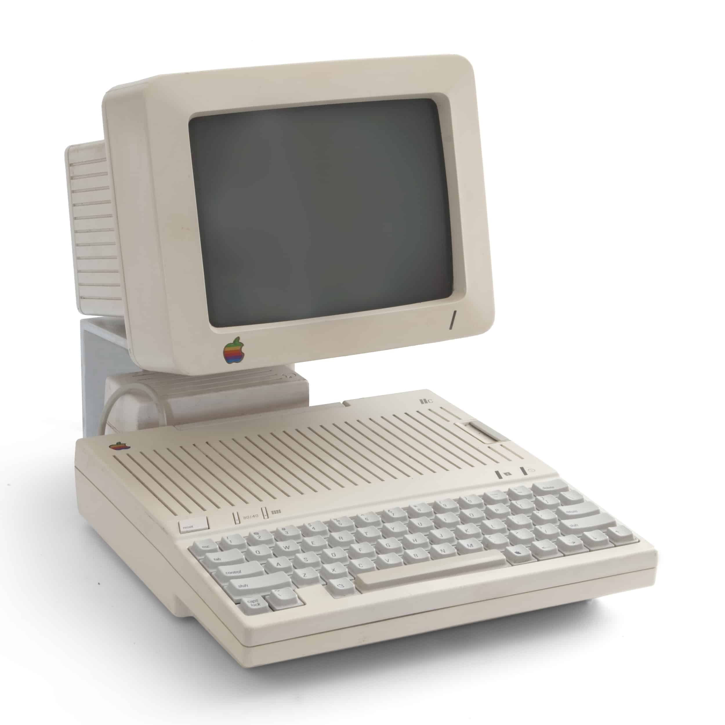
It was too late to redesign the Mac, which was already heading to tooling, so Frog’s first major product for Apple was the Apple IIc, the fourth in the line of Apple IIs and the first attempt at a portable computer (the “c” stood for “compact). More importantly, it was Apple’s first design-driven product (designed from the outside in, rather than the inside-out). The design was so compelling, the engineers bent over backwards to accommodate Esslinger’s designers, rather than fighting their ideas. It was a small but subtle shift; an early attempt to make Apple design-driven rather engineering-driven. The Apple IIc was named “Design of the Year” by Time Magazine and inducted into the permanent collection at the Whitney Museum of Art.
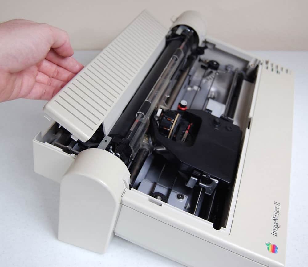
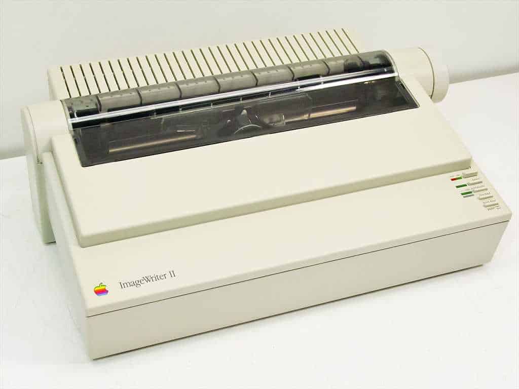
Snow White’s next big hit was the ImageWriter, a humble dot matrix printer. Dubbed the “poor man’s laser printer,” dot matrix printers were primitive noisy printers, low on the totem pole. Apple’s previous efforts were ugly, but the Snow White language could give even the humblest product a sense of style. The redesigned ImageWriter was a huge success, thanks to it’s slick, off-white shell, which gave it a space-age look. One reviewer described it as a “a cross between the lunar lander and paper shredder,” and people bought it as a piece of desktop sculpture. “People who knew nothing about design saw it and bought it because they liked the way it looked,” said Apple designer Daniel Peart. It was an early lesson in the power of good design.
Apple’s dot-matrix printer before Snow White styling:
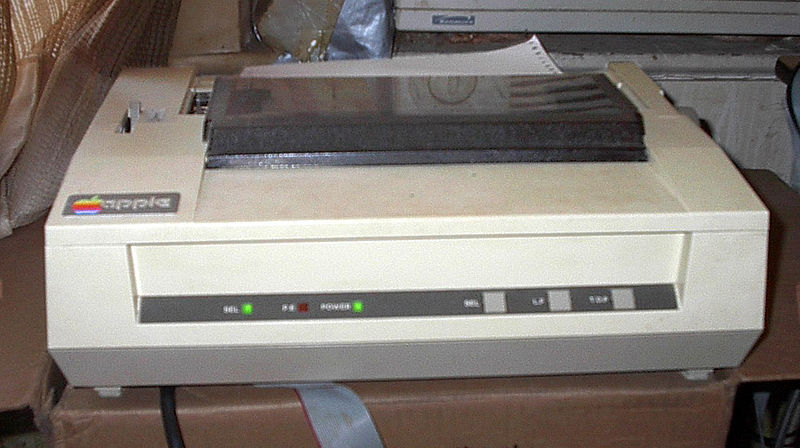
After Snow White styling:
Post Jobs
Jobs was forced out of Apple in 1985 after losing a boardroom battle with John Sculley for control the company. But in his absence, the design wheels he’d set turning helped push Apple to to the top of the rapidly-growing PC industry. Apple’s revenue soared from $700 million in 1982 to $4 billion in 1986. Of course, the easy-to-use Mac software and the desktop publishing revolution were key too, but good design played a major role. In fact, the combination of killer design and killer software would be key to Apple’s later success.
But without Jobs, design at Apple eventually lost its place at the heart of the company. Without a champion, design became just another voice at the table — as detailed in the previous chapter – and eventually became subservient to marketing and engineering.
“Jobs was unique because he just had to develop great products. He was driven to do it. “ said Tony Guido, one of Esslinger’s designers. “That made him the best ally in the firm. He shared our dreams and understood what we were trying to do.” But when Jobs left, no one wanted to push the envelope any more. “Suddenly our role was to do the work and keep our heads down.”
Bob Brunner made an attempt to make the company more design-driven, with limited success. And when Jony took over the department, with the company losing market share and in financial crisis, things got worse.
Jobs Brings Focus
When Jobs returned, he brought focus to the company, and also to Jony’s design group.
Jony was ostensibly in charge of the design group, but their efforts weren’t unified. The group was in chaos, just like the rest of the company. The design department was fractured and rudderless. It was full of talented but willful designers, each working on their own projects with little or no coordination. There was no leadership from Jony, according to Doug Satzger, who was hired in 1996.
“Each designer had his own agenda, or her own design impulse, and there was no control [over their activities],” Satzger said. “One designer had an agenda over what a laptop should be; another had an agenda over what a printer should be. There was no consistency on what the next PowerMac tower should be. The design group was not set up so that designers could work collaboratively as a team. All the designers were independent and had their own strong design sense. It was like they were all working for different companies. And Jony Ive let this happen.”
Satzger said three designers were working on an update of the PowerMac, a powerful computer for professionals that came in a tower configuration. Each of the designs differed from the others. “There was no consistency,” said Satzger. “Danny [De Iuliis] had designed a perfect cube with wheels on it. It was pretty big. Danny Coster was working on a model that consisted of various blocks thrown together, while Thomas Meyeferhoffer’s design for the tower was all slurpy with lines all over — it was a monolithic piece of art. And the team was going ahead with not one of them but all of them.”
Brunner and Esslinger had both allowed designers to explore different design directions. Brunner in particular liked to treat the early design process almost as a competition. But he’d eventually choose the best ideas. Esslinger too would unify the best ideas into a single design direction. Jony had worked in this kind of environment for several years, but didn’t seem willing or able to provide a strong lead.
This is where Jobs stepped in. Jobs was busy shutting down unpromising projects and trimming back to just four products: his 2×2 matrix. Satzger remembers Jobs coming to the studio and telling the designers that Apple would be putting all its wood behind just four products. The first would be a desktop for consumers. “Steve said, ‘My daughter was going to college, and I’ve looked at everything out there and they’re all crap. There’s a real opportunity. Our target now is to build an Internet computer.’ He was envisioning the iMac. That was the new focus.”
++
Espresso Era
Moving to Cupertino
In September 1992, Jony accepted a full-time position at Apple and flew out to California with his wife Heather. He was 25 years old. The couple moved into a modest house on San Francisco’s Twin Peaks — the highest hill in the city. Their house enjoyed a stunning view of the city — all the way down Market Street to the skyscrapers downtown. “There is a fireplace in the sparsely appointed interior and a tiny television sitting atop an upscale stereo with a turntable, and virtually all the furniture is on wheels,” wrote reporter John Markoff, who visited Jony and his wife for a New York Times profile. “The room is lighted by a futuristic lamp, which appears to hang like a red orb, but there isn’t a personal computer in sight.” Jony bought an orange Saab convertible for the commute to Apple, about 35 miles away down the Peninsula in Cupertino.
In 1992, Apple was firing on all cylinders. It had grown from a tiny startup in Steve Jobs’ garage to one of the largest companies in the fast-growing PC industry. It was still several years before Apple would get into trouble. John Sculley was the CEO, having ousted Steve Jobs in a boardroom coup some seven years before. Jobs was struggling to make his followup companies — NeXT and Pixar — get off the ground. But at Apple, things couldn’t be rosier. The computer industry was exploding. Along with its rivals, Apple was riding the wave of the PC revolution. 1992 was a record year for revenues: Apple pulled in just over $7 billion, making it one of the biggest companies in the industry.
Having grown on the back of the desktop publishing revolution, Apple was expanding its product lines. The company was branching out from its core customer base in education and desktop publishing. It had introduced a super successful line of portables — the PowerBooks — and new, low-cost computers for ordinary consumers, the Performas.
Sculley was also getting a lot of attention for talking up a new line of innovative hyper-portable computers he called “Personal Digital Assistants,” a term he coined at a major speech at the Consumer Electronics Show in Las Vegas. Although it would be a couple of years before Sculley’s PDA would actually hit the market as the Newton MessagePad, the industrial design group was already hard at work on it.
Inside Bob Brunner’s Studio
Jony went to work in the industrial design group’s studio on Valley Green Drive in Cupertino, a short walk from Apple’s main campus on Infinite Loop.
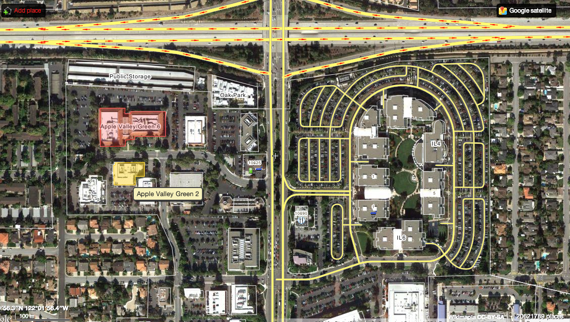
At the time, the design studio was in Valley Green II, a large, low-slung building at 20730 Valley Green Drive that is surrounded by a few small trees and a big carpark. It’s on the other side of De Anza Drive, the main road through the center of Cupertino. Almost all of the buildings in the area are leased by Apple, making this part of Cupertino look like a company town. Apple’s first office, on Bandley Drive, is just around the corner.
Valley Green II, or VGII as it was known to Apple staffers, is about as nondescript a building as you can imagine: a featureless box in a business park full of other featureless boxes. Inside was a different story. Where the outside of the building was blank and featureless, the inside was filled with product prototypes and mockups. There were designer ‘toys’ everywhere: spendy bikes, TK and TK. There was an expensive CNC milling machine, and later an early 3D printer for making prototypes. On the walls were big glossy prints of some of the group’s best work.
“The ID studio at Apple was a cool workspace, with open cubes,” recalled Rick English, a photographer who did a lot of work with Apple in the 80s and 90s. In 1997, English published a book about the design group with Paul Kunkel, a freelance writer, called Apple Design.
“It was pretty fun visually,” English recalled. “Typical ID space. Toys everywhere. Lots of mountain bikes.” English worked with a lot of other design studios in the Valley, but Apple’s stood out. “They were having a lot more fun,” said English. “It fostered this really creative, take-a-risk atmosphere, which I didn’t see at other firms.”
Brunner’s recruitment to Apple:
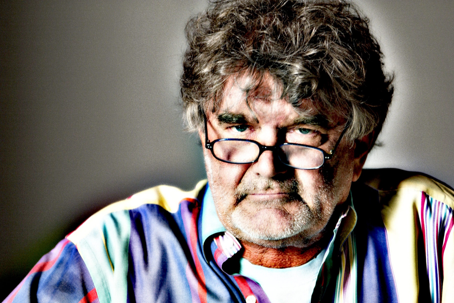
Designer Robert Brunner, former Director of Industrial Design at Apple
The design studio was the brainchild of Robert Brunner. It was Apple’s first internal design studio. Most design work had been outsourced to outside design agencies. And the choices Brunner made in setting it up were auspicious; they’d have wide-ranging impact on Apple later on after Steve Jobs returned.
Before Brunner, Apple had contracted most of its design to Frogdesign, a full-service design consultancy run by the hotshot German designer Helmut Esslinger. However, in the late 1980s, Frog was starting to get expensive. Its billings were more than $2 million a year, twice what it would cost to use other outside design firms and much more expensive than running a small in-house design team. But Apple was stuck in a contract that Jobs had struck up with Esslinger in the early 80s, and couldn’t get out without paying a huge penalty.
By 1987, Apple was starting to think seriously about building an internal design team, but without Jobs, the engineers had no idea where to start. Because design had been contracted to Frogdesign, there were no designers on staff. And because Apple had been working exclusively with the company, there were no relationships with other design firms. Management at first tried to find a superstar designer to replace Esslinger, thinking the firm needed someone with a world-class reputation.
In early 1988, they embarked on a worldwide tour of the world’s most famous design studios on a quest to find a superstar designer, a fruitless search that at one point bordered on farce. They travelled to Europe and Asia, interviewing design firms like Porsche Studio. They visited top designers in Tokyo, London and Berlin. But none were quite right. In Italy, they visited Mario Bellini — the so-called “crown prince of italian design,” who rudely dismissed them. Not to waste the trip, they set up a meeting with Italian designer Giorgetto Giugiaro, the world famous “Car Designer of the Century” who is synonymous with Italian style. Giugiaro designed more cars than anyone else in the twentieth century. Hired by Fiat at age 17, he was responsible for scores of gorgeous Bugattis and BMWs, Maseratis and Ferraris.
When Apple executives went to visit him in his giant, factory-like, ultra-secure Italdesign studio near Turin, he was sketching with one hand, talking on the phone with another, while continually issuing orders to his many minions. The executives were so impressed, they offered “Il Maestro” a $1 million contract to design concepts for just four products, which they hoped to use as models for a whole line of products. But Giugiaro was used to designing cars — from the outside in. He would make loose, impressionistic sketches of cars, which his model makers would use to make 1:1 clay models. Often, the finished models would differ from the sketches, sometimes quite a lot. Over several months, the Apple engineers discovered that the Italdesign studio’s model makers did most of the actual design; Giugiaro was more of a muse. His sketches were more inspiration for the finished designs. It was the opposite of the way things were done in California. Giugiaro applied the same methods to the Apple commission: His model makers designed the computer casings using clay — just as they would high-end Italian sports cars — with little regard to the internal components, and the models didn’t translate to manufacturable products.
At one point, the Apple team also went to see hotshot Swiss-born German designer Luigi Colani, one of Jony’s design heroes, who was famous for crazy, “biodynamic” designs of cars, motorcycles and consumer goods. Colani gave them the idea of a split ergonomic keyboard based on the idea that men like to grab women’s backsides. After delivering a lecture at the Art Center College of Design in Pasadena, he was asked about the future of keyboards and launched into a long diatribe comparing keyboards to women’s bottoms. Since men like to grab women’s rears, the keyboard should be split up the middle to accommodate different hand sizes, he said. To illustrate his loony theory, he drew a woman’s bottom with keys on it and handed it to one of Apple’s staff, who was almost too embarrassed to take it. Back at Apple HQ, the story spread, and the staffer’s colleagues bought a female mannequin and stuck keys to it, replacing his regular keyboard. The stunt drew outrage from Apple’s female staff, but the idea remained. Apple’s computers soon had split ergonomic keyboards.
Meanwhile, Apple was making vast sums of money riding the desktop publishing revolution. Thanks to the Mac’s graphical user interface, great layout software and cheap laser printers, Apple was selling boatloads of machines to newspapers, magazines and book publishers.
At the end of 1988, Apple had three factories working 24 hours a day, seven days a week, processing more than 40 million pounds of plastic. It had a budget of $200 million for R&D, but one executive joked at Macworld that it had nothing to spend it on. There were 20 products in various stages of development, but no concepts. Some of Apple’s various departments — peripherals, portables, desktops and so on — had started working with outside firms like Lunar and IDEO, but there was no coordination between groups. Apple had reverted to the pre-Snow White days. Once again, the company needed a unified design language to give the products cohesion.
During the past couple of years, Apple had been working quite a lot with Bob Brunner at Lunar. The first projects were bluesky projects, designed mostly as tests — like the one Brunner would later give to Jony at Tangerine. It was all under the table. Apple couldn’t formally work with another design firm because of the exclusive Frog contract. Apple’s accounting department wouldn’t pay anyone for design work unless the invoice included Frog’s name and vendor number. But Lunar called it “product design” instead, which implied engineering rather than design, and no one in accounting had heard of Lunar so they got paid.
Apple sent less and less work to Frog, the billings dropped precipitously and eventually stopped paying the firm its retainer. Meanwhile Esslinger was secretly working with Jobs at NeXT, his new startup — in violation of the contract with Apple. In TK, the two companies agreed to nullify their contract.
Apple realized that it had its superstar designer right under its nose: Bob Brunner. Brunner had been doing stellar work, and the company had been delighted with everything he’d done. Brunner was attending design meetings and making suggestions for maturing Snow White and transitioning Apple to a new unified design language. Apple started trying to recruit Brunner, twice offering him the job of design director, but he wasn’t interested because Apple had no design organization. He felt the job would be a dead end: he’d end up a middle manager overseeing outside designers like himself.
“I didn’t want to work at company that wasn’t designing its own stuff,” said Brunner. “I didn’t want to manage people doing the creative work, I wanted to do the creative work,” he said. “Of all the companies in the world, this company could have a really amazing in-house design team… it should have a really amazing studio, it has great products. A great brand. Great history.”
By 1989, Apple was getting desperate. Apple tried again, this time asking Brunner what would it take? Brunner said he wanted to build a great team. Turn Apple into a world-class design company. But Brunner didn’t want to build a big design organization. “There are great corporate design divisions in companies — Nike, Samsung — but they are massive, multi-armed.”
Instead, Brunner wanted to recreate a small design consultancy like his company Lunar, but within Apple. “The original premise was we have a small, really tight studio,” he said. “We would run it like a small consulting studio, but inside the company. Small, effective, nimble, highly talented, great culture. And that’s what we set out to do. It was because really, I didn’t know any other way. It wasn’t a flash of brilliance: that was the only thing I knew how to do.”
Plus, there weren’t any good models to emulate. No other company in Silicon Valley had anything like an internal design group. “We weren’t really emulating anybody,” Brunner said. “The culture out here is very fast moving, very entrepreneurial, very idea oriented. That kind of creative studio in companies works here. It may not work in other company cultures.”
Apple agreed and Brunner joined the company as head of industrial design in January 1990. He was 32 years old. “I thought I’d made a huge mistake. I got there and it was, here’s your cubicle, in a sea of engineers. I thought Oh God, what have I done?”
Setting up studio:
Despite his intentions to hire a dream team of designers, it was about 18 months before Brunner settled in and started hiring in earnest. In 1991, he started really building the team, but first he had to find a cool place for them to work. “We set about creating a cool studio inside the company,” Brunner said. “That was essential to recruiting talent. I can’t have people working in cubicle hell. They won’t do it. I have to have an open studio with high ceilings and cool shit going on. That’s just really important. It’s important for the quality of the work. It’s important for getting people to do it.”
Brunner found an underutilized building that Apple was leasing on Valley Green Drive, a leafy road not far from the main campus. The building was VG II — right across from VG 6. Half of the building was available. It was a big open space with 25 to 30-foot ceilings. In the other half of the building was Apple’s Creative Services group, who are known as Apple’s “In-House Design Consultants” and are called on to produce brochures, manuals, branding materials, in-store posters and displays, exhibits, and video promos. Crucially, the building was not directly under the noses of Apple’s meddlesome executives. “I liked that it was off the beaten path,” Brunner said.
Brunner worked with Studios Architecture, a San Francisco design firm, to transform the interior into a cool design studio. [TK MORE ON STUDIOS ARCHITECTURE]. Apple had standardized on Herman Miller office furniture — the company credited with inventing the cubicle — but Brunner didn’t assemble it into cubes. Instead, the desks were arranged in unusual formations around the space. “We used the taller structures as spines running around the studio and the work spaces running off it,” said Brunner. “The corporate planning people didn’t get it. They said you can’t do that, but that’s what we did, put it together in different ways. It totally freaked them out. It was great, a lot of fun. We just made it less oppressive.”
Brunner had a CAD workstation installed for creating 3D models of designs; a CNC milling machine to turn the CAD models into foam ones; and a paint shop for testing different colors.
TK — IS THIS STANDARD DESIGN SHOP SETUP: CAD, CNC, COLOR?
Brunner started recruiting in earnest. But it was tough going attracting talent. Apple had no reputation for doing its own design: it had outsourced it to Frog. Talented, ambitious designers would rather go to firms like IDEO, also in the Bay Area. To help with recruiting, Brunner took a leaf from Tangerine’s book. He created mockups of fantastical Apple products and ran big glossy photos of them on the back of I.D. Magazine, the international design bible. One was a gigantic bicycle navigation computer that showed maps and local landmarks on a black-and-white screen. Another was a chunky wristwatch ‘computer’ the size of a cantaloupe. “They were concepts, not real products,” said Brunner. “They started to get attention. It was totally recruiting. No other reason. They were sketchy, information appliance models. A little bit tongue in cheek, but it served its purpose.”
When Jony arrived, he joined a group of eight talented designers, some of whom would continue to work with Jony for decades and contribute to Apple’s smash-hit successes. When Jony joined in 1992, Brunner’s team consisted of Tim Parsey, Daniele De Iuliis, Lawrence Lam, Jay Meschter, Larry Barbera, Cal Seid and Bart Andre.
[TK CUT THESE MINI BIOS? Meschter is a talented industrial designer who worked at Apple between 1990 and 1997 and went on to be the creative force behind Nike’s Flywire technology as part of the shoe company’s highly regarded Design Kitchen team. At Apple, Meschter worked on nearly all of the major projects of the time.
Larry Barbera was one of the product design leaders at the industrial design team and worked at Apple between 1987 and December 1995. His tenure coincided with the work of Apple’s earliest mid-80s designs, from Hartmut Esslinger’s Frog Design (including Snow White) and the Robert Brunner era. Barbera would end up leaving the company along with Brunner. Barbera received a BS degree in Industrial Design from the Ohio State University
Tim Parsey is from the U.K, graduating from the Central Saint Martin’s School of Art and Design in 1982 with a degree in Industrial Design. Recruited from IDEO in 1991, Parsey was quickly designated as the unofficial administrative leader of the group. He worked for the IDg group until 1996. Two of his designs at Apple, the Stylewriter II printer and the QuickTake digital camera are part of the permanent collection of the Museum of Modern Art in New York.
Daniele De Iuliis (pronounced day-YOU-lease) was perhaps the most talented of the group. Born in Bristol, UK, of Italian descent, De Iuliis graduated in 1983 from the Central Saint Martins School of Art and Design in London with a BA in industrial design engineering. Brunner hired him in 1991 from the San Francisco office of design group ID2 (where Jony’s friend Grinyer had earlier worked). Brunner specifically wanted designers with experience in consulting. “After experiencing the inertia that exists inside Apple, Bob realized that by hiring former consultants he could operate with the speed and efficiency of a freelance group,” said Parsey. “As a former consultant, Bob knew that we would think and act like consultants.”
Fellow designer Barbera was impressed with his personality right away: “Danny, in particular, gave off that weird light that other designers tend to notice. I took one look him and figured that our work was gonna get a lot better, fast.”
De Iuliis was able to give his designs strong personality, a skill that served him well later on. One of his early projects was the Macintosh Color Classic, an update to the original Mac that exuded a ton of personality and was avidly collected by fans for years. He would later work on the MacBook Pro and the iPhones 4 and 5. He was granted a patent for the iPod shuffle (fourth generation) along with other designers. He is named in more than 560 patents inventions, which are vast and varied in scope. They include innovations in 3D cameras, multitouch displays, location tracking, RFID transponders, nitriding stainless steel, magsafe charging mechanisms, the iPod, improved speaker enclosures, and on and on.
De Iuliis was an early champion of CAD within the group. “Designing with CAD doesn’t change our ideas,” he said. “It helps us realize them in ways 2-D drawings cannot.”
Later in his career, De Iuliis would receive top design awards for his work. TK AWARDS. De Iuliis and Jony lived close together in San Francisco and commuted together for more than 20 years.
In 1992, the group recruited Bartley K. Andre, an intern in Apple’s Personal Intelligent Electronics, or PIE group (no joke). Better known as Bart, Andre graduated from the University of California at Long Beach in 1991. Doing some freelance consultant after graduating, Andre was building products that were noticed by Brunner. Andre was the lead designer on several notable products, including a line of leather and metal-bound PowerBook laptop concepts designed with Jony.
Over the years, Andre would become one of the top five patent-holders in the United States on a year-to-year basis. Thanks to his last name, he is listed on all of Apple’s major patents in the title. “United States Patent Application Andre et. al.” By 2013, Bart had more patents to his name than any other Apple designer including Jony. In 2009, he received 92 patents and 114 in 2010, a record number of patents for an Apple designer. Most of the patent awards were for innovations on the phone, tablet, and laptop lines.
Andre has worked on everything at IDg, from circuit modules to the RFID systems. He received the Red Dot award, along with the team, for his work several times. Among the most important awards in the industry, the Red Dot was given based on his work for the iBook, the iMac 4G, the wireless mouse, the wireless keyboard, and the Titanium PowerBook G4.
Andre is also credited with the design of Apple’s 035 design prototype of the first iPad, according to information released during the Apple-Samsung trial in 2012.
When Jony joined the design team, they were excited about him joining them. “Bob knew the effect that a strong new designer would have on the group,” said Meschter. “When Daniele De Iuliis and Tim Parsey first arrived, our whole approach to design changed. But when Jonathan came on board… the group really took off.”
In the summer of 1994, Daniel J. Coster joined the team. A “tall, goofy, super-talented” New Zealander, Coster is one of a small number of top world designers from Down Under.
Coster earned an industrial design degree from the Wellington Polytechnic school in New Zealand in 1986. Following graduation, Coster ran his own consultancy in Wellington for a year before spending four years working in Australia for the KWA Design Group, also in New Zealand. At KWA, Coster gained product experience designing furniture and sports equipment. He would later say his work at KWA influenced his decision about joining Apple. “Having worked on a range of consumer and lifestyle options, I want to inject some of that spirit into Apple’s next generation computers.”
During a visit to the United States in 1993, Coster showed his portfolio to studios in New York and California and began working for Apple. In June 1994, Coster took a three-month position as a contract worker at Apple and worked on colors and finishes for the Newton portable. He designed various towers and gained notice for being the lead designer of the Bondi-Blue iMac. Later, he worked on the iBook and TK G4 during Apple’s renaissance as well as most of the other major products of the 2000s, including the iPhone and the iPad.
By 2004, Coster and the rest of the Apple team were receiving constant praise and awards for their innovative product output. Together, they won the Design of the Decade Gold Award from the DA&D, the industry’s top honors, as well as the British Design and Art Direction Association.
Walter Isaacson’s biography of Steve Jobs describes Coster as the “top deputy” to Jony in the last few years. In total, Coster has received nearly 600 patents working for Apple during the last 20 years.
In 2012, Coster was inducted into his alma mater’s design Hall of Fame. An induction in the Hall is made to those school graduates “who have made an outstanding contribution to New Zealand’s economy, reputation and national identity through art and design.” Previous inductees include Sir Richard Taylor of Weta Workshop (the Lord of the Rings movies), sculptor Len Lye, and fashion designer Kate Sylvester. Massey CoCA students and alumni greeted his induction with great affection. On Twitter, one CoCA alum cried, “Bless you Danny you changed my life!”
Coster was also prominently involved in the recent Apple-Samsung trial. He testified on the following topics of his expertise: design and development of Apple’s iPhone, iPad and iPod Touch products.
Group Structure
To run the group like an outside consultancy within Apple, Brunner set up a loose management structure, which largely persists today. The main focus was a “pool” of designers, who worked together on whatever project the group was facing. “There was the studio, the pool of talent,” Brunner explained. “We’d work on multiple projects, and move from project to project, pretty much the way he [Jony] does it today.”
Brunner also made about half a dozen of the designers “product line leaders.” There was a product line leader for each of Apple’s major product groups: CPUs, printers, monitors and so on. The PLLs acted as the primary contacts out to the company. “Each designer was liaison to each group,” Brunner said. “The product groups felt there was a contact within the design group. They managed the communication and the different needs of each group. I didn’t know any better. I ran it like the Lunar studio. There’d be discussion of a project. We’d design it, make it and ship it.”
However, as Apple grew and thrived, riding the DTP revolution and the exploding market for PCs, the group found itself churning design after design on shorter and shorter schedules. When Brunner first started at Apple, the product development cycle was 18 months or more. “It was crazy generous,” Brunner said. “You had an amazing amount of time to make something work. And within a matter of years, that shrunk to 9 to 12 months, and sometimes even 6 months if there was a quick turn on something. All of a sudden, what got compressed was our thinking time. It still took just as long to implement something, but the time to explore, to test and to play with, just went away.”
At this point, Brunner formulated his offline “parallel design investigations,” which allowed the group to explore forward-looking concepts without the pressure of a production deadline. “We had an enormous number of products in the pipeline: two lines of desktops, monitors, printers, mobile products. Way too many. It was an enormous amount of work. More than we could handle.”
In addition, Apple’s internal culture heavily favored the engineers within the product groups. The design process was engineering-driven. In the early days of Frogdesign, the engineering groups had bent over backwards to help implement the design team’s ambitions, but now the power had shifted. The different design groups gave their products in development to Brunner’s design group, who were expected to merely “skin” them.
To shift the power from engineering to design, Brunner started thinking strategically. “We began to realize we need to own this thing more,” Brunner said. “We began to do more longer term thinking, longer term studies around things like design language, how future technologies are implemented, what does mobility mean?” The idea was to get ahead of the engineering groups and start to make Apple more of a design-driven company, rather an marketing or engineering one. “We wanted to get ahead of them, so we’d have more ammunition to bring to the process,” Brunner said.
One of these longer-term studies was the Juggernaut project with Tangerine. Brunner used several other outside resources for his investigations, especially Lunar and IDEO, a practice that continues to this day, although Jony and Steve Jobs never admitted it publicly. It also allowed the overworked design team to work with talented designers not on the Apple payroll. “Sometimes we wanted to hire specific designers to act as part of the team, to use them as freelance talent,” Brunner said.
++
Brunner was good at getting attention for the group, which inevitably led to design awards. Every month, Brunner continued to run ads on the rear cover of I.D. magazine. Instead of bluesky concepts, Brunner ran a big glossy photo of one of his designer’s prototypes, just to give them attention and make them feel good.
A lot of the photography was contracted out to Beverley Harper and Rick English. For English, the Apple design group turned into one of his biggest clients. English spent a lot of time at the studio photographing foam models, the rough, early prototypes that followed them, and the final detailed models. English also shot the finished products themselves; a ritual that signalled the end of a long, sometimes painful project. “Typically, by the time a product was ready for a photo shoot, the designer had been working on it for at least six months or a year,” he said. “The photo shoot was in a sense what made the product real. If the photos appeared in BusinessWeek, for example, they could be seen by ten or fifteen million people.”
It was expensive. English said he was billing the company at least $250,000 a year. Some of the work that the team had done was displayed as big photos on the wall of the ID space. “In the space on Valley Green, we had some Rick English shots and Beverley Harper shots: some of the work we were doing in detail,” recalled one designer. “And we had those on the walls and that was it. There wasn’t much.”
Brunner also liked exploring parallel design concepts, setting up projects almost like competitions. For every product that could have got made at Apple, there were two to ten design directions that they explored. “It was almost like a competition, which Bob encouraged,” said English. “Then, when one of those designs was selected it became that designer’s baby all the way till completion.”
“And I photographed all the designs. The mindset was that there was going to be a historical archive of all the things they worked on. In that group, they absolutely believed that their work had such importance. They were just then breaking away from the gray-box look of computers. Of course, not all the stuff they designed was ever produced.”
The design group continues to document everything it does. Sally Grisedale, the former manager of Apple’s Advanced Technology Group, which worked closely with the design group, said the systematic documentation set Apple apart.
“It’s all written down. It has to be. There are so many moving parts,” she said. “Even when I was there, all the processes were worked out. That’s why [Apple] was such a perfect company to work for, because they had booklets on how they do it, and they helped you, when building the software or the hardware, it had to be really systematic. So it was a very rude awakening for me to go a different company like Excite or Yahoo because they had none of that! Nothing written down. Like, process? Are you kidding? Just ship it and get it out there!”
In hindsight, Brunner’s choices — the studio’s separation from the product groups, its loose structure, collaborative workflow and consultancy mindset — all of these turned out to be fortuitous. One if the reasons Apple’s design team has remained so effective is because it retains Brunner’s original structure. It’s a small, tight, cohesive group of extremely talented designers who all work on design challenges together, just like the designers did at Lunar, Tangerine, and other small agencies.
+++
The Design Team
[TK PARSEY WAS NUMBER 2, BUT PASSED OVER WHEN BRUNNER QUIT] Jony soon began to emerge as second in command to Brunner. Not only did he provide brilliant ideas and superb design taste, he was helping to build the design team that he would later head up and go on to create a string of groundbreaking products.
Jony would be integral in the recruitment of the next group of designers. Within a couple of years in the mid-90s, Jony hired most of the team that would go on to make the iMac, the iPod and the iPhone. This group included Christopher Stringer, Richard Howarth, Thomas Meyerhoffer, Duncan Robert Kerr, and Doug Satzger.
Christopher Stringer was born in Australia in 1965 and was raised in the North of England [TK CHECK]. He attended North Staffordshire Polytechnic in Stoke-on-Trent and graduated from London’s Royal College of Art in 1986. Stringer joined IDEO in 1992 where he helped develop Dell’s design language and won an ID Design Review award for an innovative light switch.
In 1995, he was recruited by Jony as a Senior Industrial Designer, working on the early PowerBooks and tower computers. In his 17 years at the company he has been involved in all the major releases, peripherals, and in even smaller projects, like the designing of the product packaging. Stringer worked on the original iPhone and almost all of Apple’s mobile products. TK patents.
Over the years, he’s often been spotted at Apple launch events talking side-by-side with Jony, giving the impression they are close friends. They are both from Staffordshire and studied in the north of England. He was the first designer to give testimony at the Apple-Samsung trial. “Stringer looked every inch the designer with his shoulder-length hair, salt-and-pepper beard, wearing an off-white suit with a narrow black tie,” reported Reuters.
Richard Paul Howarth was born in Lukasa, Zambia, and graduated from Ravensbourne college in London in 1993. At college, he won an apprenticeship with Sony in Japan for a minidisk Walkman prototype called the Telephatik Fish. After graduation, Howarth went to the Bay Area to work at IDEO for a few years before joining the Apple IDg group in 1996. He worked on the PowerBook line with Christopher Stringer and over the years became one the group’s main designers. He was the lead designer of the original iPhone, and a major contributor to the iPod Touch and iPad.
Another designer from the UK, Duncan Kerr is a current Apple industrial designer with nearly 15 years’ experience building the company’s most important products. Like several others, Kerr was recruited from IDEO, where he met several of his future Apple colleagues. At IDEO, Kerr worked on many projects in interaction design, often developing innovative working prototypes.
As one of the team’s technical and engineering leads, Kerr has great influence in the development and investigations of new products and technologies. He helped pioneer the multi-touch technology that led to the iPhone and iPad. He is often one of the first contacts between the ID and Product Design groups. Kerr graduated from the Imperial College London school with a degree in Mechanical Engineering in 1985 and followed it with a two-year degree program at the Royal College of Art in Industrial Design Engineering. While at Apple, he has received numerous patent awards. They include recognition for his work on the iPad, iPod flash, iPod nano, iPhone, the latest earphones and various technical innovations involving components like proximity detectors, display modules, and magnetic connectors.
Doug Satzger worked at Apple between 1996 and 2008 in the Industrial Design Group. An Ohio native, his interest in materials and knowledge of manufacturing processes made him the group’s design lead for color, materials and finishes, working on the first iMac to the latest iPhone, iPods, iPad and MacBooks.
Satzger attended the University of Cincinnati and graduated in 1985. He started his career at IDEO as an industrial design lead, before designing TVs at Thomson Consumer Electronics.
Satzger’s has been named in many patents, mostly in packaging, electronic devices, displays, cursor controls, and connectors.
Satzger was heavily involved in the development of the colorful line of iMac G3s, whose success and popularity, most of it based on Satzger’s whimsical color choices, led to Apple’s renaissance. He also came up with the iPod’s iconic earbud cables’ white color.
After Apple, Satzger joined HP/Palm as the senior director of industrial design. Satzger is currently the vice president of the Mobile and Communications Group and general manager of Industrial Design at Intel.
TK — Russell-Clarke?
De Iuliis spelled out Jony’s recruitment philosophy and expectations. Engineering and computer skills were a plus, but not absolutely necessary. The group would rather hire a talented car designer than a mediocre computer one. “We are looking for personality, overwhelming talent and the ability to work in a small group,” said De Iuliis. “We also want to be impressed with a designer to the point of intimidation.”
The other key member of the group at that time was Calvin Seid, a native of Portland, Oregon, who graduated from San Jose State University in 1983 and worked for design firms in Oregon and Silicon Valley after graduation. He joined the Apple IDg in 1993 to design and manage CPU projects. His first major design for Apple was the Quadra 605, code-named ELB for Extremely Low Budget. He knocked it out of the park. His design would be considered a classic and expanded to several more systems. Seid received more than 80 patents. He died unexpectedly on April 6, 2007, of coronary artery disease at the age of 46. He was popular and his death upset the team greatly.
The design team was distinctly international, but largely white and male. Except of Sied, who was of Filipino descent, the team were all young white guys. There were also no women until the 2000s, when Jony hired Jody Akana [TK MAYBE Kristi Bauerly and Irene Chan-Jones. They remain the only [TK TWO or THREE?] two women on the team.
“Jony’s had that core of people around since then, they’ve been commuting up and down highway 280 together for 20 years now, between San Francisco and Cupertino,” said Sally Grisedale. “They’re tight. They’re family. Many started as single men and then they had families and now all live in the same neighborhood.”
The iDG was a great place to work, but nobody ever quit. The lack of turnover was a challenge for the group. It was difficult to bring in fresh talent. It worried Jony: “Though we don’t want people to leave the group, the lack of movement makes it difficult to bring in fresh talent,” he said. “We need new people at regular intervals to prevent ourselves from stagnating. But this can only happen if other people are willing to leave.”
[TK MOVE Over the years, the core members of the group would be Jony, Stringer, and Howarth.]
The Espresso Aesthetic
Now that the team was in place, they started working on a new design language for Apple’s products. The older Snow White language was getting long in the tooth, and besides, it was hard to adapt it to Apple’s growing range of products. Snow White had been invented for computers, not printers, handhelds, speakers and portable CD players.
The team developed a new language called “Espresso,” a Euro-style aesthetic characterized by swooping organic shapes, bulges and an adventurous use of colored and textured plastics. It was less a design language than a loose set of guidelines and best practices: an aesthetic. There were no hard and fast rules. But like pornography, the designers knew it when they saw it.
One of the first Espresso products was the Macintosh Color Classic, an update of Steve Jobs’ original Mac by De Iuliis. Like the Mac, it was an all-in-one machine, but De Iuliis lengthened it’s face, made the vents look like gills, gave it a higher forehead and made the floppy slot even more mouth-like. It was more bulbous and curvy than the original, with a distinct personality. Users went nuts and turned it into a highly-collectable machine.
The most distinctive “Espresso” touch were a pair of small round legs at the front that looked like the feet of a baby elephant. The “fat feet” became one of the most distinctive elements of the Espresso look. They tilted the computers upward by six degrees and made them look “like an eager pet staring up adoringly at its owner,” said Don Norman.
The feet came about through a stupid lucky break. “Came from a fuck up,” said Norman. “Early pizza box machine was about to go into production, [we] focused so much on making it slim and flat we forgot about the floppy slot on the front. Not enough room to insert a disk with a keyboard in front of the machine. So we added a pair of feet at the front that tilted the box up. Had the unexpected effect of giving the machine a lot of personality… [and it] became a design feature that was featured prominently for five years.” Indeed, it was a design language that influenced later generation of smash-hit products after Jobs returned. The iMac has its origins in Espresso.
The Espresso name, interestingly, has two possible origins. The official story from Apple is that it was inspired by the minimalist design of the modern European coffee pots the group used while working. The unofficial, and more likely story, comes from Don Norman: “The name was a derogatory term applied to the new design team who had just installed a fancy espresso coffee machine in the studio. One old-time engineer said it was a sign of the ‘yuppification’ of Apple, and started calling them ‘espresso.’ The funny thing is, the designers didn’t get it and adopted the term for their new design language.”
++
When jony started at apple, there was Brunner and tim parsey and under tim was jony and other designers. And parsey is design language written up document of all the specifications of how you design something. You know ‘the vents have to be this way, the colors have to be this way’, the radius on things iOS only this, ‘ that’s design language, that’s how you define a language and that’s very typical in designing in. Apple’s initial design language snow white, all those things were based on color, corner radii,\ part to part flat size, gapping between all the vents, how you could use and you can introduce new things to them, it was hard , and you broke that, that’s where steve comes in, or if it was jony and team, and the design quality is the material ands the quality that you build into the product.
Tim parsey was espresso, it wasn’t a real design language, I interviewed about 4-5 months after bob left. When i interviewed, parsey was still there but on his way out. Lawrence law was still there but on his way out. Pretty much everyone was there other than the core team of Danny D, Bart and Jony, and Cal. And the rest of the team were hired within a two year period — stringer, howarth, meyerhoffer, satzger, duncan kerr,. That was the core team for years. And then rohrback, then whang, then shin, then rico. Then Peter Russell-Clarke.
Satzger on motivation — designing for Steve, and for themselves.
Plus how previous design era was rule based, whereas Jony’s approach was looser, freezer
Do you ever talk about the story of the product? How you define what it is? We never really talked about stuff like that. Jony talked about some of that stuff. Newton was a time period at apple where everyone was looking for a story. Because of presenting things ‘ think of this’ . From my opinion, the way we worked was, we sit down and say ‘steve has asked for this cool thing and we want to present this cool thing to steve, what would we want in it from the designers. If you look at the way apple does things, we don’t have to go in with 12 designs and get the opinion of a group of people and then it goes out and does research on it and all that and see if it’s successful. Everything we do would be what do we want this product to be, for ourselves. We would ask what would steve want, [but in a way more[] what do we make something that we really want and what are the things that we can design into it that would make it better than everything else but also something that we want and we always built the designs around those qualities. And it was a really open discussion always. Because of how close everyone was in the group, it didn’t matter if i said it or jony said it, or chris said it, you know that’s a really stupid idea, and then you can say, well i don’t know, or you can defend it, and then the tower, the existing tower, that thing they had going in all types of different directions but it’s sort of like, why are you thinking of it that way? It was very fluid, very productive. Plenty of times, we’d sit for three hours and there wasn’t much that came out of it other than a bunch of drawing in a book but other times, everything that happened came out of it.
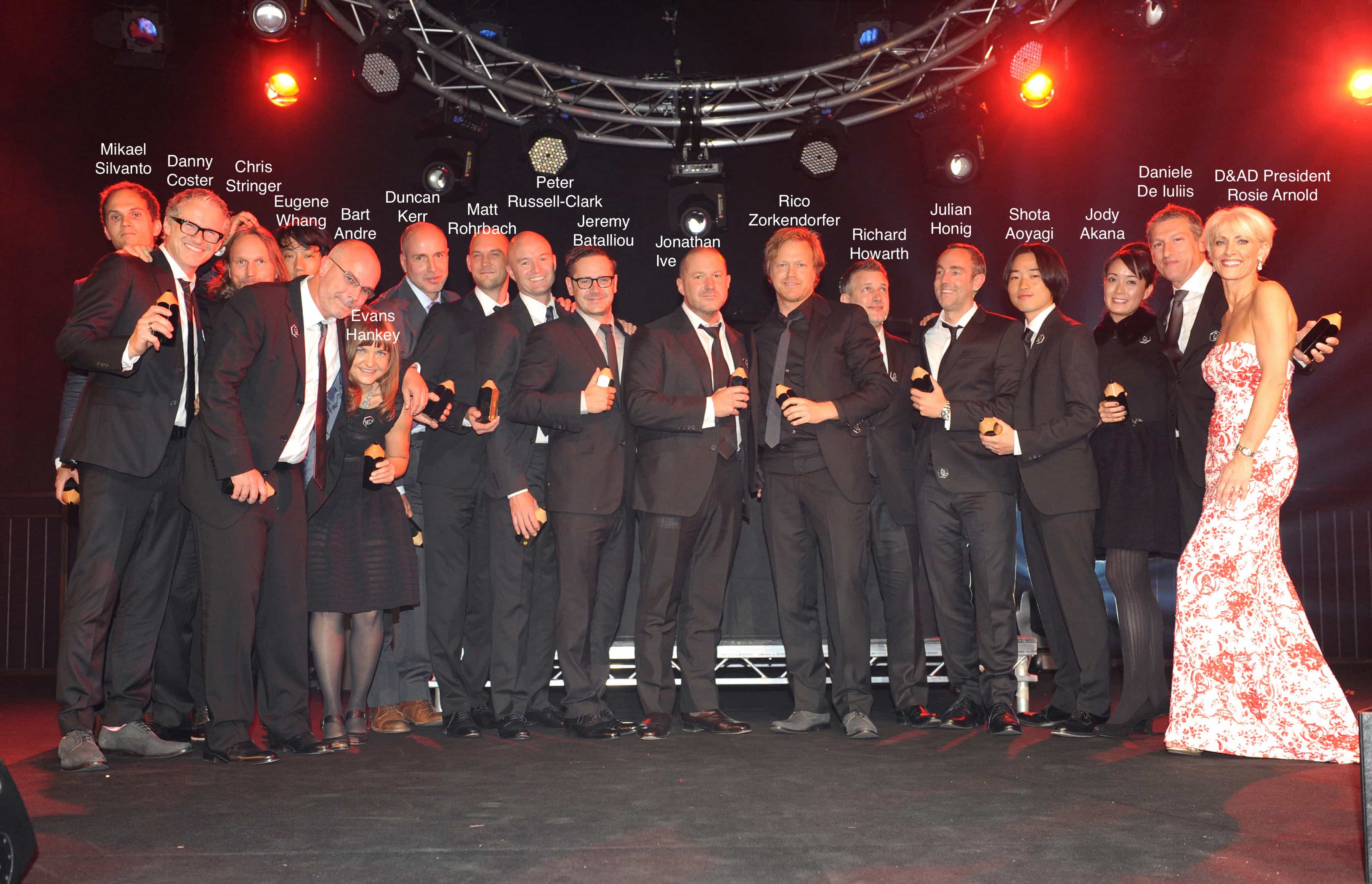
The British Design & Art Direction (D&AD) awards are the most prestigious awards in the industry — the Oscars of the design world. Jony Ive has a record number of D&AD awards. He has six Black Pencils — the highest, which range from Yellow Pencils to Black. This is more than anyone else, ever; and he got them in a stretch of just 10 years. One Yellow Pencil makes a career; Black Pencils are much rarer, a sign of genius.
In 2011, for the first time ever, Apple flew the entire industrial design team to London to pick up an award for the Best Design Studio of the Last 50 Years. It was one of the first public recognitions for the group as a whole, and they felt it was important enough to fly the extremely reclusive, ultra secretive group en masse from California to receive it.
But none of the designers are named individually on the award. And even though they all had their picture taken at the ceremony, Apple’s handlers gave very strict orders that the photographers did not list their names. “They were very specific about not publishing everyone’s names after the pic was taken,” said the photographer of the picture above, Noah Da Costa.
To the public, they are anonymous. Here’s who they are (in alphabetical order):
Jody Akana

Credit: Facebook
Jody Akana keeps a very, very low profile. Unlike other members of the team, she appears to have no LinkedIn account or personal website. Searches reveal no previous employment history or education background. However, she appears to be a Hawaiian native in her mid-thirties. She joined the design team in the late 2000s, and is credited as the engineering program manager for the iPad. She’s named on about 200 patents, most of them for the iPhone and iPad, including their packaging and accessories like docking stations.
Bartley “Bart” Andre
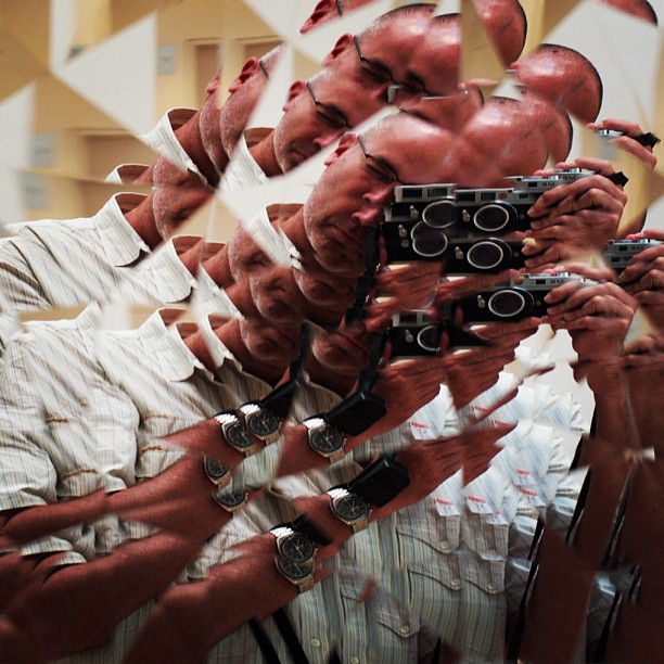
Recruited to Apple in 1992, Bart Andre is a graduate of the University of California at Long Beach. He was working as an intern in Apple’s Personal Intelligent Electronics, or PIE group, when he became friendly with the design team and was recruited into their ranks. He has emerged as one of the top five patent holders in the United States on a year-to-year basis (thanks to his last name, he is listed on all of Apple’s major patents in the title: “United States Patent Application Andre et. al.”). By 2013, Andre had more patents to his name than any other Apple designer including Jony Ive. In 2009 alone, he received 92 patents; in 2010, his 114 set a record for an Apple designer. Most of the patent awards were for innovations on the iPhone, iPad and MacBook lines.
Shota Aoyagi
Shota Aoyagi also graduated from the Royal College of Art in London, where he gained notice for clever drip-proof pouring devices. Inspired by the way water runs off a roof, his Roofers are special lids for jugs, thermos and teapots that channels liquid flow under the the lip of the lid, eliminating drips. Having graduated in 2011, Aoyagi is a recent addition to the team, and curiously seems to be interested in designing unusual clothing. With a partner, Junguen Lee, Aoyagi wrapped synthetic fibers around molds to create unusual, sculptural garments. See below for other recent additions tot he design team with expertise in clothing and fabrics.
Jeremy Bataillou

A native of France, Bataillou graduated from Paris’ École Nationale Supérieure de Création Industrielle in 2005 with a Diploma in Industrial Design. He joined the team around 2006 just before the launch of the first iPhone. According to his Bataillou worked on iPhone, iPad, MacBook, EarPods and iMac, and a lot of accessories. Including smart cover Shares patents for docks, packaging, about 96 patents.
Daniel Coster

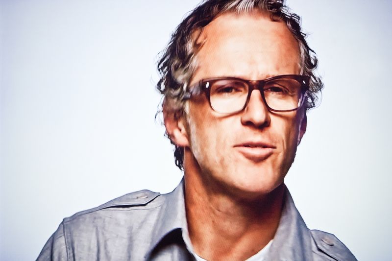
Daniel J. Coster joined the team after Jony Ive, arriving in June 1994. Described as “tall, goofy [and], super-talented,” Coster had earned a degree in Industrial Design from the Wellington Polytechnic school in New Zealand in 1986. Initially hired on a three-month contract, he impressed the group with work on colors and finishes for the Newton MessagePad, then was hired full time. He designed various tower computers and gained notice for being the lead designer of the Bondi Blue iMac. Like his coworkers, Coster has rapidly accumulated patents, receiving nearly six hundred working for Apple over the last two decades. He shares patents for iPod, iPhone, iPad, iMac and dozens of other products. In 2012, Coster was inducted into his alma mater’s design Hall of Fame for “an outstanding contribution to New Zealand’s economy, reputation and national identity through art and design.”
Daniele de Iuliis
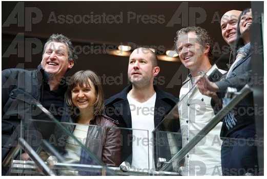
Daniele de Iuliis
Daniele De Iuliis (pronounced day-YOU-lease) was born in Bristol, United Kingdom, of Italian descent. He is a graduate of the Central Saint Martins College of Arts and Design in London and was hired by in 1991 from the San Francisco office of design group ID Two. He preceded Jony Ive joining the group by a year. One of his early projects was the Macintosh Color Classic, an update of the original Mac that exuded character and was avidly collected by fans for years. He would later work on the MacBook Pro and the iPhones 4 and 5. His name appears on more than 560 patents. They’re vast and varied in scope, including innovations in 3-D cameras, multi-touch displays, location tracking, RFID transponders, nitriding stainless steel, Magsafe charging mechanisms, the iPod and improved speaker enclosures. He has a strong relationship with Jony Ive and has commuted with him from San Francisco for more than twenty years. They were both almost killed in a car accident coming home from Apple.
Caption – Daniele de Iuliis — is to the left in the picture above, taken at the San Francisco Apple Store during the iPhone launch (Danny Coster is to the right). Credit: AP
Evans Hankey
Evans Hankey also keeps a very low-profile. In fact, an extremely low profile. Listed on hundreds of patents as either Evans Hankey or M. Evans Hankey, he/she may or may not be a “Martha” Hankey, name that shows up in various public record searches. By a process of elimination, this would be the only woman on the team, shown sixth from the left. This is pure guesswork, however. M. Evans Hankey is listed on more than 300 patents.
Source: Evans Hankey is the ID CAD team manager. She was a rock-star PD engineer, and she took over the ID CAD group after Cal Seid died in 2007.
Julian Hönig
Julian Hönig is a native of Austria and a former car designer who has worked with Lamborghini and Audi. He was previously a senior designer at the Lamborghini Center in Italy and joined Apple’s ID team in 2010. He undertook a scholarship at the Art Center College of Design in Pasadena, a famous auto-design school. According to his blog, he’s involved with a couple of San Francisco art galleries and runs a surfboard business on the side, Awesome Surfboards.
Richard Howarth
Richard Paul Howarth was born in Lukasa, Zambia, and graduated from Ravensbourne College of Design and Communication in London in 1993. He was recruited by Apple in 1996 from IDEO and became one the group’s main designers. Howarth was the lead designer of the original iPhone, and a major contributor to the iPad. He’s regarded as one of the best artists of the group, and is co-named on about 2,000 patents.
Jonathan Ive
The boss. Here he is relaxing at the pub with
Born in 1967 in Chingford, Essex, and trained at Northumbria Universtiy, Jony Ive was recruited to Apple in 1992. Within just a few years, thanks to his diligence and talent, he was appointed head of the studio. He struck up a close relationship with Steve Jobs when Apple’s co-founder returned to turn the company around. In the following dozen years they helped turn Apple into one of the world’s biggest, most profitable and powerful companies. He leads the design studio arbitrates every design decision. Under his leadership, industrial design has become the inventive brain of Apple, pioneering most of the company’s innovation.
Duncan Kerr
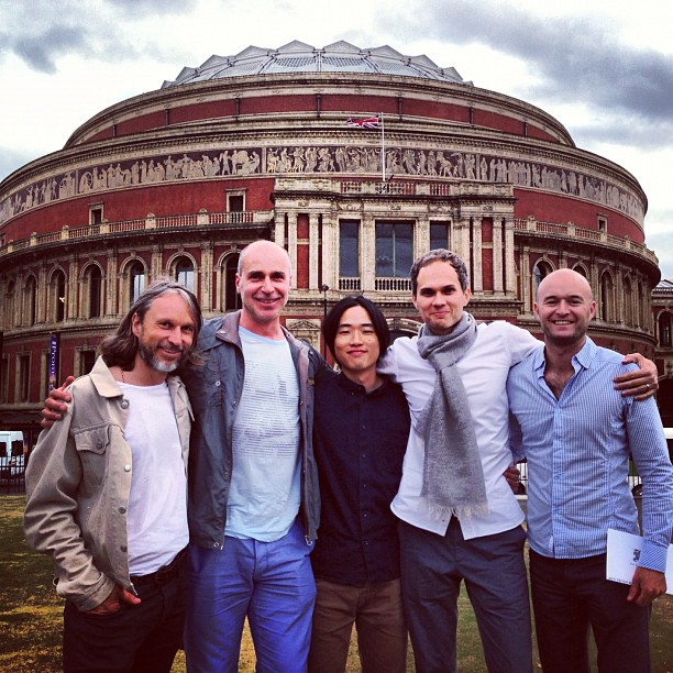
Another designer from the United Kingdom, Duncan Kerr graduated from the Imperial College London in 1985 with a degree in mechanical engineering and a degree in ID engineering from the Royal College of Art. He was also recruited from IDEO. As one of the team’s more technical members, Kerr has great influence in the development and investigations of new products and technologies. He helped pioneer the multi-touch technology that led to the iPhone and iPad. He has been named in numerous patents, including various technical innovations involving components like proximity detectors, display modules and magnetic connectors.
Shin Nishibori
In his late 40s, Shin Nishibori was a noted designer in his native Japan before he was recruited to be a member of Apple’s ID team in the late 2002. Nishibori has been involved in almost every one of Apple’s major product designs since that time. There are scant clues to his specific contributions, beyond mention in scores of patents for products ranging from MacBooks to the iPhone. Nishibori left Apple in July 2010 and now runs a cafe and shop in Tokyo. He appears to spend a lot of time in Hawaii, according to his social network posts. He was requested by Samsung to testify during the Apple/Samsung trial but complained of ill health and didn’t take the stand. Samsung presumably wanted to Nishibori to address a “Sony-style” concept for the iPhone he’d made at Jony Ive’s request during the development process. Samsung had hoped to prove that Apple had copied Sony to make the iPhone.
Matthew Dean Rohrbach
Matthew Dean Rohrbach is another of the designers with a very low profile. So low, I couldn’t find any information about him at all — and can’t be sure which one he is in the D&AD award photo, or if he’s even in it. Nonetheless, Rohrbach has been a member of the team since at least 2000 and is named on more than 500 patents.
Peter Russell-Clarke

Like several others on the team, Peter Russell-Clarke is a graduate of London’s prestigious Royal College of Art, one of the UK’s top design schools. Before joining Apple, Russell-Clarke co-founded Stromatolite, a London design lab. He is already named on almost 300 patents dating back to just 2010. Peter Russell-Clarke appears to be related to an Australian TV chef of the same name.
Douglas Satzger

Doug Satzger is another IDEO alumnus. Satzger attended the University of Cincinnati and graduated in 1985. He started his career at IDEO as an industrial design lead, before moving to design TVs at Thomson Consumer Electronics. He would work at Apple between 1996 and 2008 in the IDg. An Ohio native, his interest in materials and knowledge of manufacturing processes made him the group’s design lead for color, materials and finishes, working on the first iMac to the latest iPhone, iPods, iPad and MacBooks. Satzger has been named in many patents, mostly in electronic devices, displays, cursor controls, packaging and connectors. After Apple, Satzger joined HP/Palm as the senior director of ID then moved to Intel, where he’s vice president of the Mobile and Communications Group and general manager of ID.
Chris Stringer

Christopher Stringer, born in Australia in 1965, was raised in the North of England. He attended North Staffordshire Polytechnic in Stoke-on-Trent and graduated from London’s Royal College of Art in 1986. A veteran of IDEO—hired in 1992, he helped develop Dell’s design language and won an ID Design Review Award for an innovative light switch—he was recruited by Jony in 1995 as a senior industrial designer. Stringer has been involved in all Apple’s major products (including the iPhone), peripherals and in even smaller projects, like the design of product packaging. He was also the first designer to give testimony at the Apple v. Samsung trial, where, according to Reuters news service, “Stringer looked every inch the designer with his shoulder-length hair, salt-and-pepper beard, wearing an off-white suit with a narrow black tie.” Stringer was often seen at Apple launch events talking side by side with Jony. The impression they are close friends is enhanced by their shared history; both hail from Staffordshire and studied in the North of England.
Mikael Silvanto
A native of Norway, Mikael Silvanto also graduated from London’s Royal College of Art, according to his LinkedIn profile. He worked for an engineering company associated with Feedship, the company that built Steve Jobs boat. He was recruited to Apple in October 2011. Among other things, he helped create a clever speaker that changes function according to its orientation. Equipped with a motion sensor, the speaker can be assigned to a different Dolby Surround channel depending on its orientation.
Eugene Whang
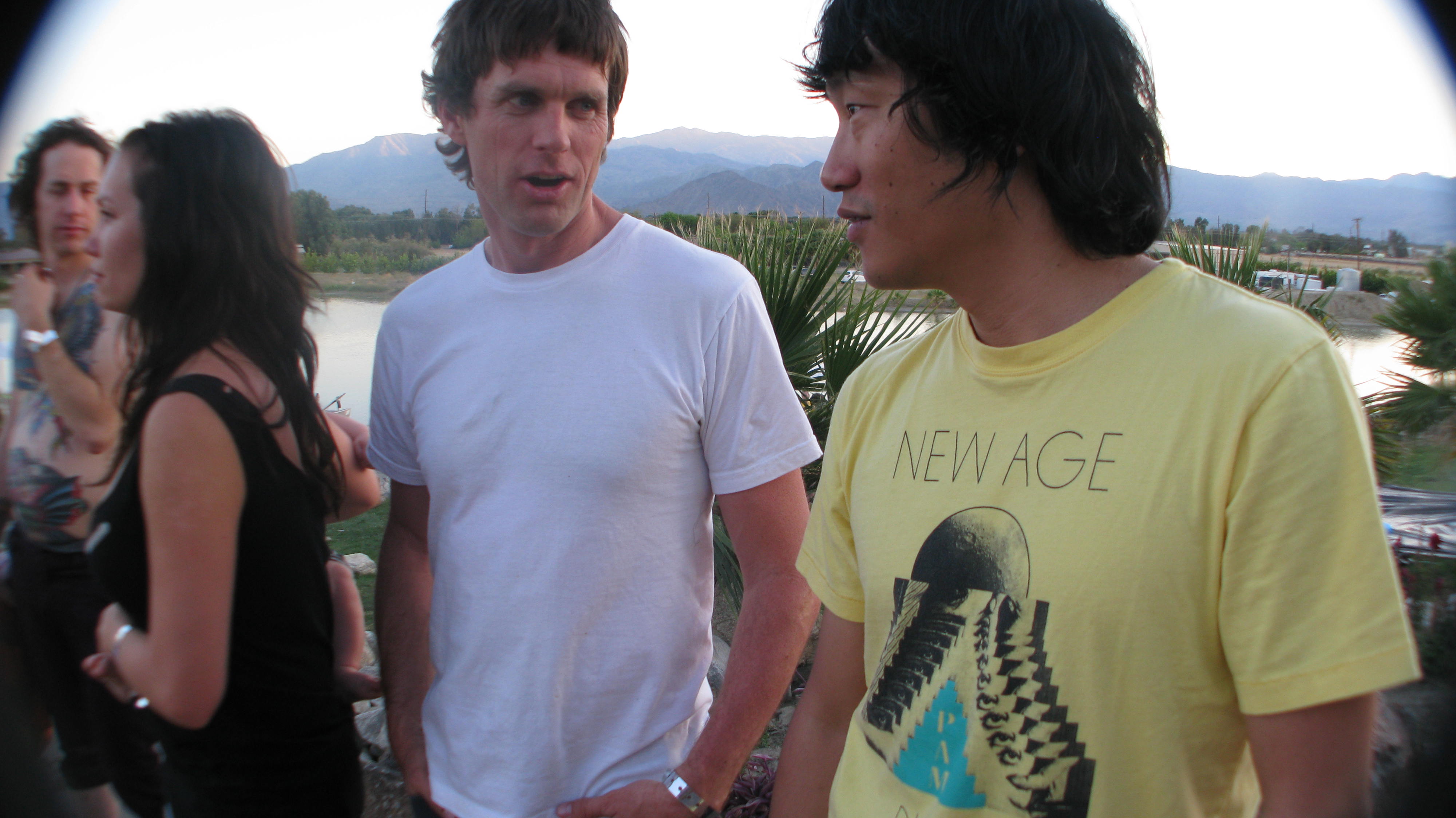
One of Eugene Whang’s online profiles claims he was born and raised in an Igloo, but has lived in California since 1999. Whang is one of Apple’s main designers, co-named on nearly 600 patents including the key patents of the iPod, iPhone and iPad. He a music fan and has been spotted at Coachella and other events. He writes about art and music, and runs a record label in San Francisco, which hosts regular DJ nights at a local nightclub.
Rico Zorkendorfer
Rico Zorkendorfer is another graduate from the Art Center College of Design in Pasadena, Calif., and a recruit from IDEO. He has been a member of the design team since the mid 2000s and is named on more than 500 patents, including the iPhone’s TouchID fingerprint sensor.
Recent Recruits
Daniel Spence
Another recent hire is Dan Spence, a specialist in welding and fine art who hails from Los Angeles. He joined the Industrial Design group in April 2012, according to his LinkedIn profile. Apple recently added friction stir welding to its manufacturing arsenal, although it’s not clear if Spence is involved in that effort.
Billy Smith
Hired in July 2012, Billy Smith was a top wetsuit designer at Patagonia. A keen surfer, Smith is also part owner of Sporting Sails, which makes special sails for skateboarders to help control fast downhill descents.
Ben Shaffer
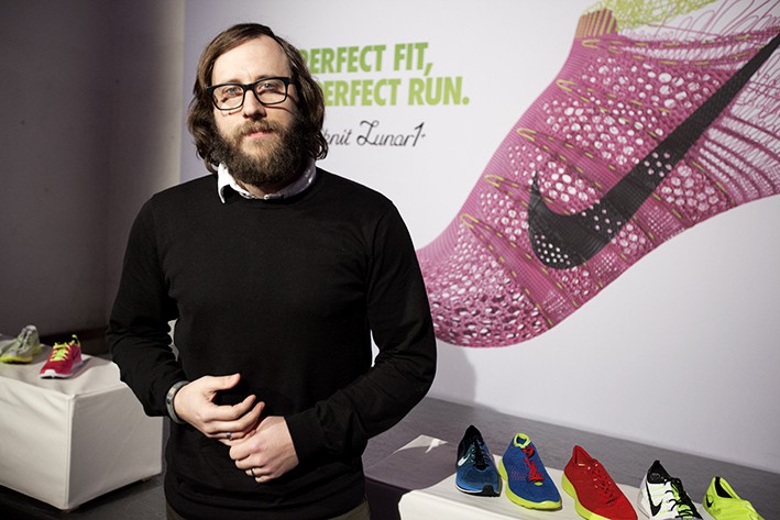
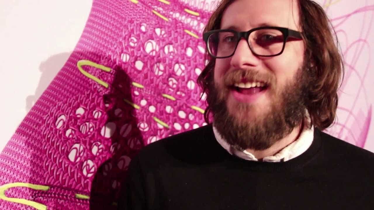
Another intriguing recent addition to the IDg team is Nike Shoe designer Ben Shaffer. The former studio director of Nike’s Innovation Kitchen, an in-house innovation lab, Shaffer is an expert in cutting-edge knitting technology. He is credited with pioneering Nike’s FlyKnit shoes, a line of ultra-light athletic shoes that are made by knitting yarns with different tensile strengths into a strong but lightweight upper.